Category Archives for "Market Analysis"

89 Year Echo

89 Year Echo in the Stock Market?

No one knows for sure what the stock market is going to do. But I am always looking for patterns that might give clues. So when you think about historic price action in October, a stock market crash is definitely one that comes to mind.

The last time we were at an Elliott Wave SuperCycle wave high was 1929. The 1929 Crash occurred from September 3rd to November 13. That was exactly a Fibonacci 89 years ago. So I decided to compare the price action in 1929 to the current price action in the S&P 500 (SPX).

In 2018 the S&P 500 peaked on September 2 (closing basis).  Are we in an 89 year echo in the stock market? Watch this short video.


Hindenburg Omen

Hindenburg Omen…What is it and what could it mean?

Over the last year or so I’ve come across articles about the Hindenburg Omen.  I thought about writing a post about it but it seems that some others have done a pretty good job of that already.

Within the last year this came on my radar from a post that Jesse Felder did in November 2017 called “The Flames Went Higher“.  He recently followed that up with two posts.  One in August called “The Nasdaq Triggers Another Breadth Warning“. And then one on September 18 called “A Historic Divergence in Stock Market Breadth“. These last two are updates on the 2017 article. All of these talk abut the clusters of Hindenburg Omens and his charts show when they occurred.

Now just yesterday Tom McClellan of the McClellan Financial Publications created a post called “Ten Hindenburgs So Far“. This is a very good article because it gives you the backstory on the Hindenburg Omen and talks about what is happening now.

As Tom points out, we had ten Hindenburg Omen signals appearing in the month of September.  Now he also points out: “Not every signal leads to huge calamity of stock prices. But these signals tend to show up before big bear markets. So a Hindenburg Omen is a warning of trouble, but not a guarantee of it.”

And clusters of signals appearing in a short time span seem to be more important than individual signals, as if the market is pounding the table and saying “Listen to me!! – Tom McClellan

So I feel this is rather timely given my view of where we are in Elliott Wave cycles.  Check out these posts…the clock is ticking.


frustrations

Market Frustrations…Trade What’s in Front of You

After experiencing a strong, gut wrenching break back in January/February, the stock market refused to collapse. So far the Dow Jones Industrial Average and the NYSE Composite Index have still not moved to new highs but they have not collapsed either. The Dow Utility Index reached an all-time high in November 2017 and has not exceeded it.

On the other hand the Dow Transports (DTA), S&P 500 (SPX), Nasdaq Composite Index (COMPX)  and the Russell 2000 (RUT) all moved to new highs.  It continues to look and act like a fractured market.  All-time highs were made on these indexes in late August. We are watching to see if these hold. The DTA did close Friday at a new all-time high.

Indeed, when the top was made in January, it appeared the market completed a 5 wave move up from the March 2009 low.  That Elliott Wave count still holds for the DJIA and the NYA.  The other indices that pushed slightly higher are now best counted as being in their 5th and final wave up.

Some interesting market facts:

  • The CAPE ratio is now higher than the 1929 peak or the 2007 peak.  The only period in history, higher than where we are today, is the 1998 – 2000 peak in stock market.  [That peak was the end of Primary Wave 3 of Cycle Wave V of Supercycle III.]
  • All the largest global stock markets are down for the year with only the UK’s FTSE 100 and France’s CAC 40 briefly pushing above the January high.  China’s Shanghai Composite Index is at multi-year lows.
  • According to an August 29th article, Bloomberg says that 48% of the performance of the SPX is accounted for by the five FAANG stocks…Facebook (FB), Amazon (AMZN), Apple (AAPL), Netflix (NFLX) and Alphabet (GOOGL).  That is what I call narrow leadership.

frustration

  • And so far, of that fab five, two took huge hits this year. FB dropped 23.8% from high to low over 3 trading days in July. NFLX dropped 18% over 3 days also in July. And not to be outdone by FAANG stocks, Twitter (TWTR) dropped 30% in 3 trading days, also in July.  Harsh treatment for some Wall Street darling stocks. Sign of things to come?

Frustrations

Recently several people told me they are frustrated that the market keeps going up when it seems that it should sell off or break down hard.  No doubt it can be very frustrating to watch a market keep pushing up irrationally or when it is so completely overvalued.

The market is going to do what the market is going to do.  Price and risk management are the most important things. You need to let the market tell you that it is indeed breaking down.  Remember that famous line from the Revolutionary War, ‘don’t shoot until you see the whites of their eyes.’ The same could be said for trading or investing in the stock market.

So when I say trade what’s in front of you. What do I mean? I mean react and pay attention to what the chart and price are telling you.  Always have a plan and work your plan.  Know where you will exit a position and stick to it, no matter what.


stock market rhyme

Just Like History the Stock Market Rhymes

Mark Twain is often associated with the quote, “History doesn’t repeat itself, but it often rhymes.” I think the same could be said for the stock market.

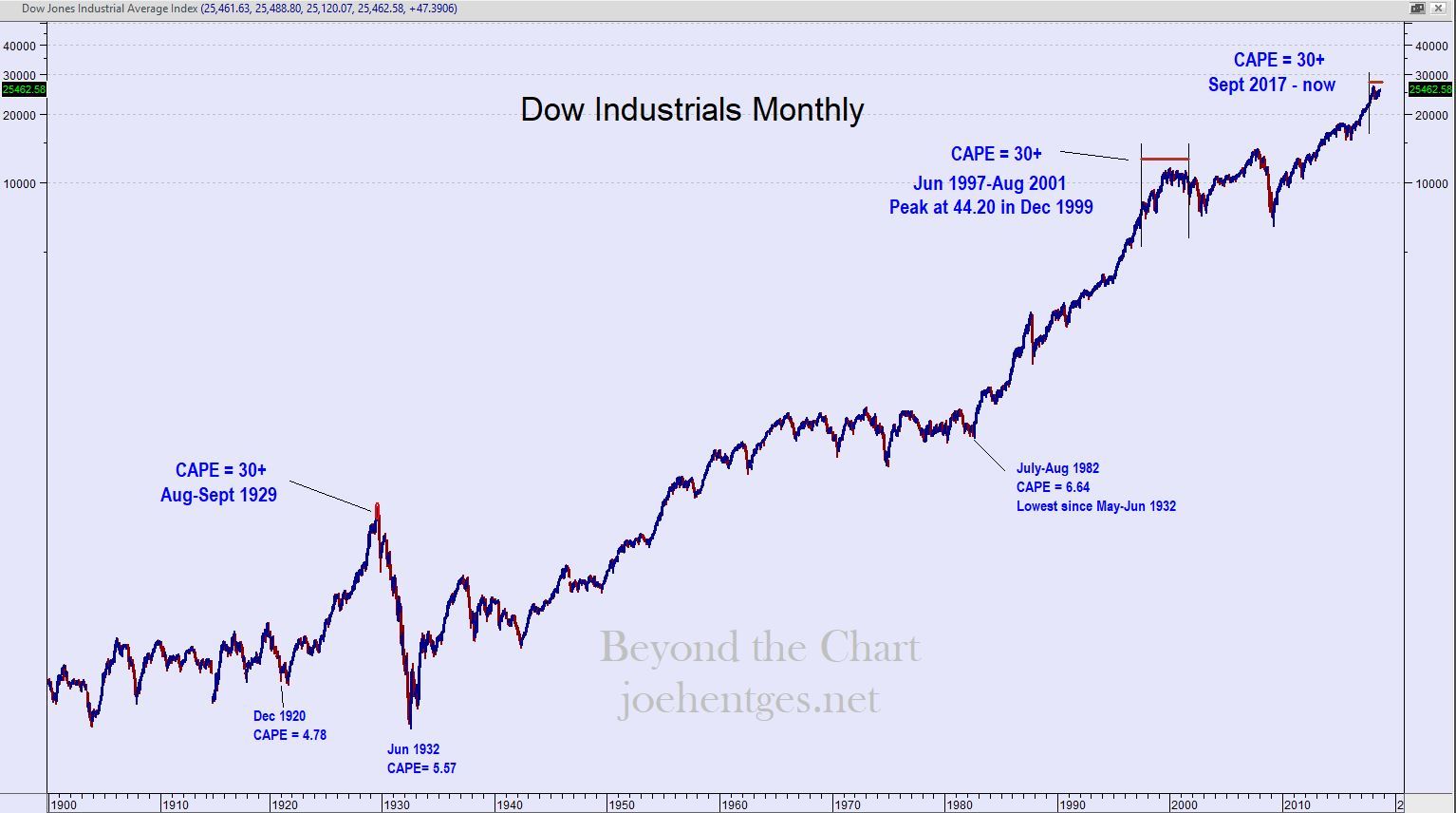
From 1986 into 1987 Paul Tudor Jones and his research director Peter Borish were following an analog model of the late 1920’s. When it came to the fall of 1987, it made them a lot of money. One could say it was a stock market rhyme with 1929.

After the 1987 crash, did we go into a 2nd Great Depression? No. In mid-1988 the stock market starting diverging from the path taken in 1930 and things changed.

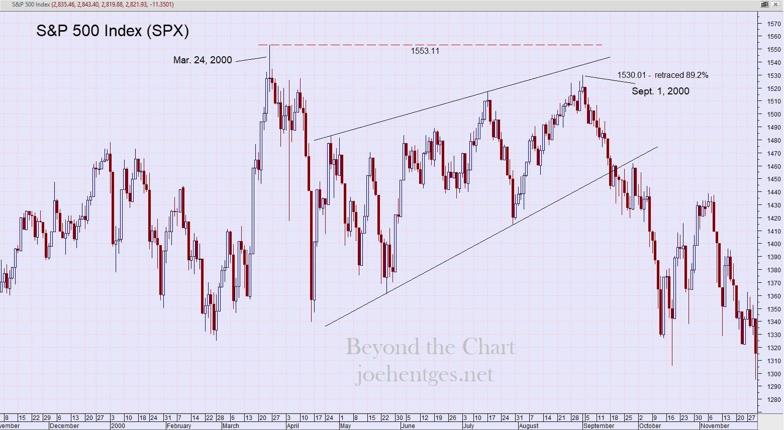
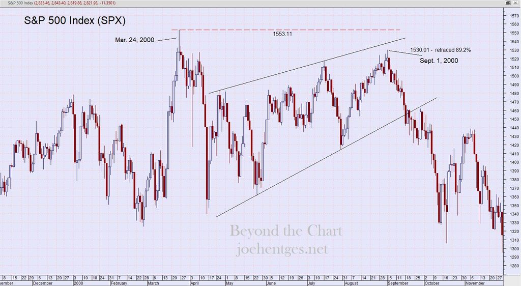
Right now the S&P 500 Index (SPX) is looking very much like a stock market rhyme to the way it acted at the top in 2000. In the first chart below you see how it looked starting from the peak on March 24, 2000, followed by a swift violent selloff over the next 15 trading days. Trading over the next 5+ months created an upward trending wedge type pattern that peaked on September 1, 2000.

The SPX retraced 89.2% of the March – April sell-off, when considering the intra-day highs. On September 1, I’m sure many investors believed that new highs were on the way.  But the SPX sold off, breaking down out of that pattern and eventually hitting bottom in October 2002.

The SPX lost 51% of its value from the high on March 24, 2000 to the low on October 10, 2002.  The March 2000 peak in the market was a Primary Wave 3 high of Cycle Wave V.

stock market rhyme

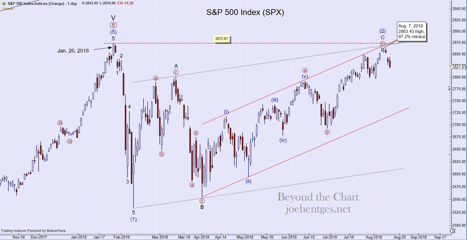
In the 2nd chart below we look at the SPX for 2018. It peaked on January 26th and then sold off violently over 10 trading days. It then oscillated up and down over the next 6 months with a counter-trend Intermediate Wave (2) high of 2863.43 on August 7.

stock market rhyme

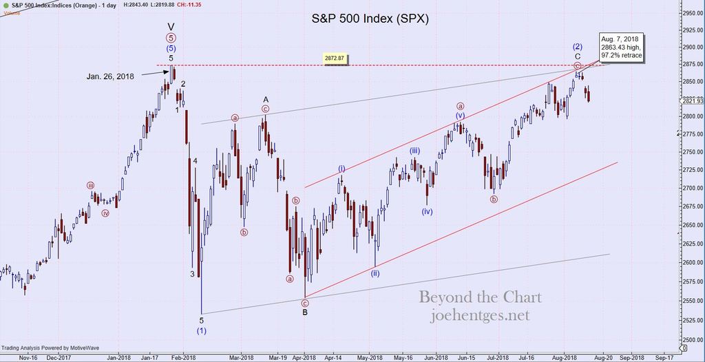
We will now see if this high will hold.  Either the market starts down in Intermediate Wave (3) or it pushes above the January all-time high.

even more overvalued

Stock Market is Now Even More Overvalued

Yes I know that I have a technical analysis perspective and focus primarily on Elliott Wave analysis. But that doesn’t mean that I ignore other pieces of financial information.  Especially when they sync with my Elliott Wave perspective showing that the stock market is even more overvalued than the Financial Crisis of 2007-2008.

I’ve published several blog posts referencing Yale Professor Robert Shiller’s Cyclically Adjusted Price Earnings Ratio (CAPE).  Professor Shiller was awarded the Nobel Prize for Economics in 2013. He authored the widely acclaimed book, Irrational Exuberance, published in March 2000, the very month of the peak in the Nasdaq Composite Index during the dotcom mania.

The first chart below shows his data for the CAPE ratio and for long-term interest rates.

even more overvalued

Data from Yale Professor Robert Shiller

This next chart is the monthly chart of the Dow Jones Industrial Average (DJIA) with notations for the times when the CAPE ratio exceeded 30. Other than where we are today, the only two other times when CAPE was greater than 30 were 2 months in 1929 and the 2000 blow-off period that started in mid-1997.

even more overvalued


In January 2018 the stock market was even more overvalued than in 1929, just prior to the 1929 Crash and the Great Depression. Preliminary data for August 2018 shows the CAPE at 32.29.  We are still even more overvalued than the 2007 peak prior to the 2008 Financial Crisis. Irrational exuberance indeed.  Stay tuned.


1 4 5 6 7 8 45

Powered by WishList Member - Membership Software