Big Tech About to Reverse

The Nasdaq Composite Index (Nasdaq) has been getting hit hard lately but hasn’t dropped as much as the Dow Jones Industrial Average (INDU) or the Russell 2000 Index (RUT).  One indication of the damage going on is the net 52 week High – Low indicator which on Friday December 3rd hit -713. 

It seems the Nasdaq and S&P 500 Index (SPX)are being held up by just a few stocks. And you know which ones these are. They are the FAANG+ stocks of Facebook, Amazon, Apple, Netflix, Alphabet (GOOGL) plus Microsoft, Nvidia and a few others.

This post focuses on the SPDR Technology ETF (XLK) and its top three holdings which make up 51.5% of all the holdings. These are Apple (AAPL), Microsoft (MSFT) and Nvidia (NVDA).  When these big tech names roll over and start to break down they will take the XLK, Nasdaq and the SPX a lot lower.

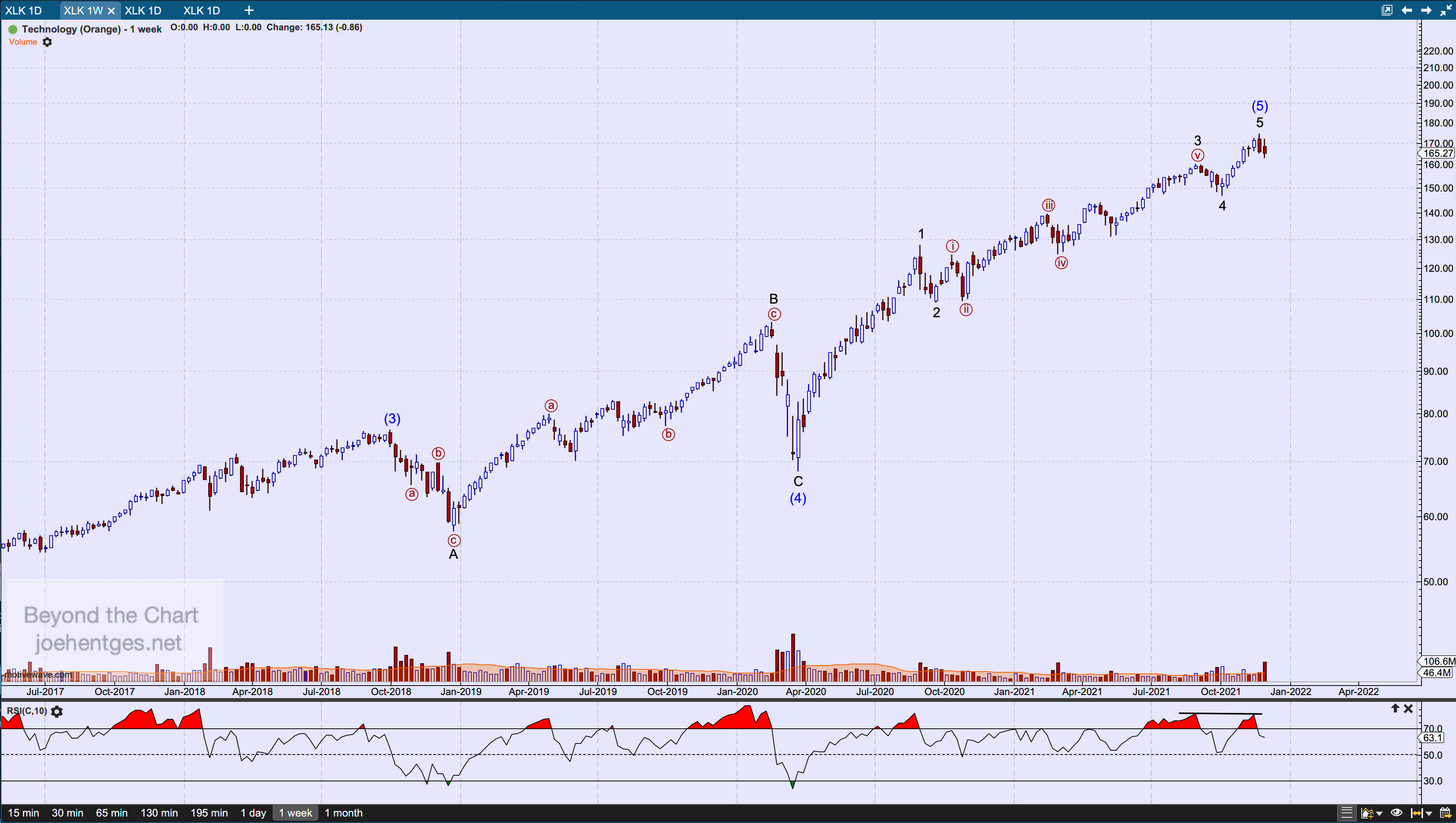
First let’s start with the XLK. Below you see a weekly chart. The Elliott Wave count shows a Running Flat Wave (4) that ended with a low the week of March 22, 2020. From that low there are 5 waves up complete with the high during the week of November 21. That high is 174.25. For this count to hold that high should not be broken.  Next up is AAPL.

Data thru December 3, 2021

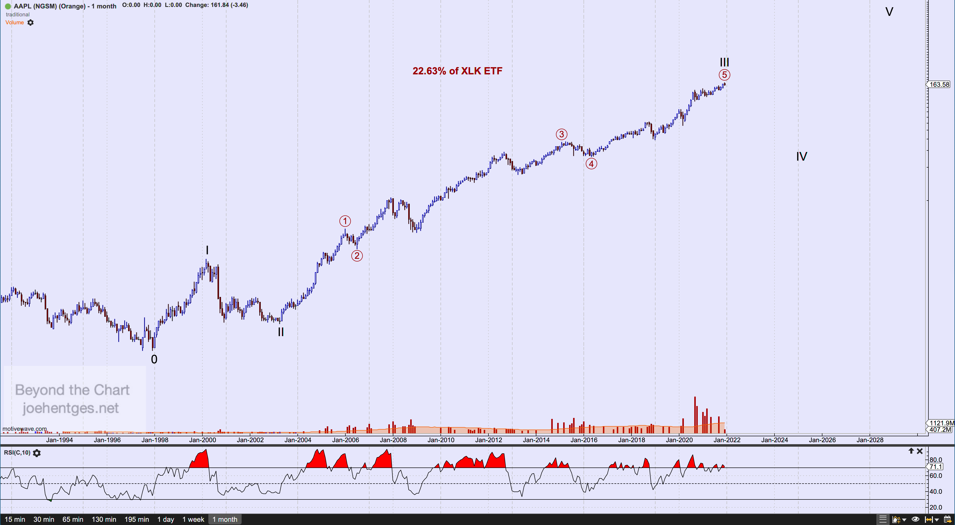
The chart below is the long-term monthly chart of AAPL This is not all the data for AAPL as it first went public on December 12, 1980. The Elliott Wave count I show starts with the 1997 low which occurred in both July and December of that year. 1997 was when Steve Jobs returned to Apple. I show that AAPL just completed a huge Cycle Wave III up from the Wave II low in April 2003.

Data thru December 3, 2021

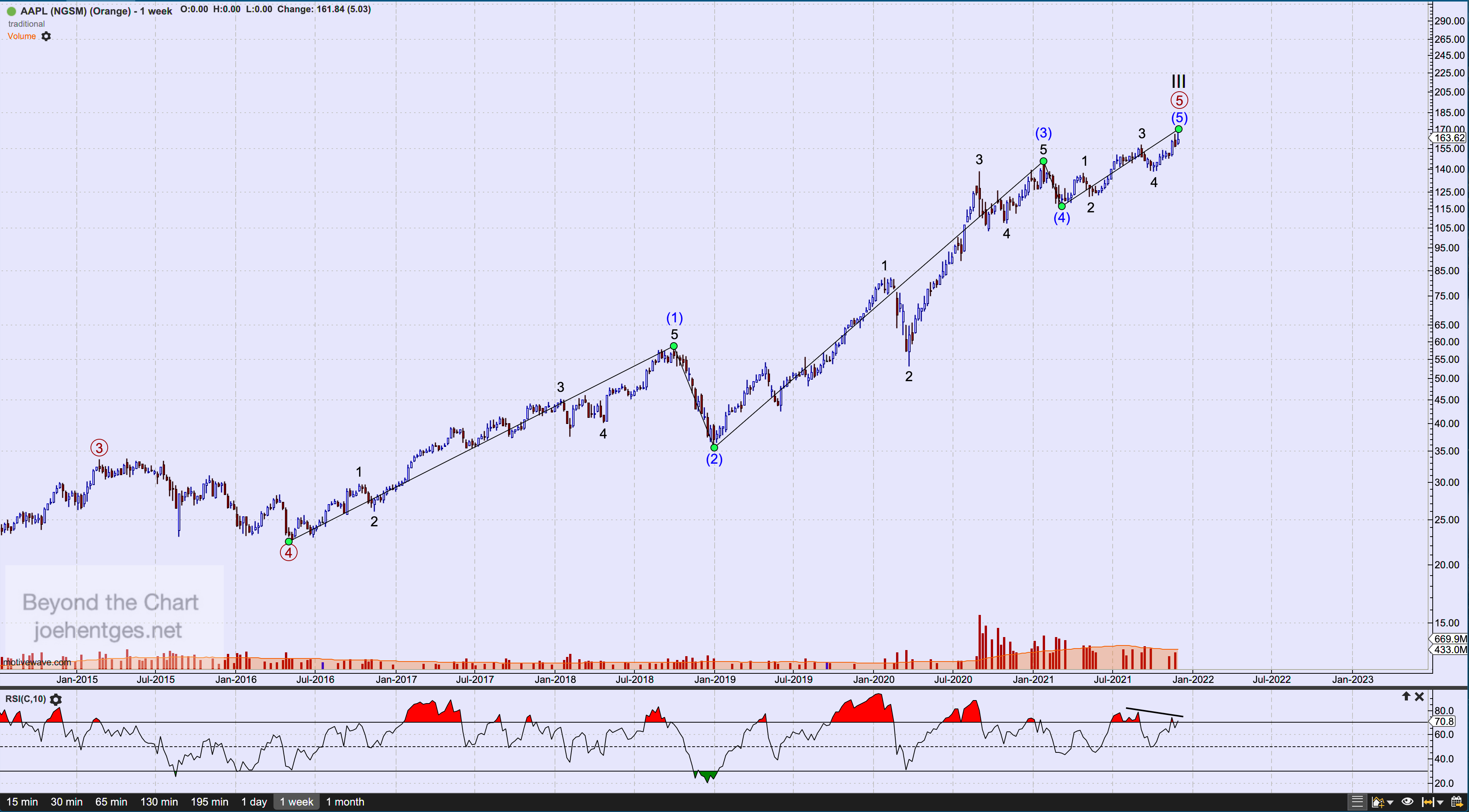
Now let’s look at the weekly chart. In the weekly chart below I show the five intermediate waves up from the 2016 low and the five minor waves that complete Intermediate Wave (5).  I expect the $170.30 high to hold or the 5th wave up is not yet complete. At this point watch closely for a continued break down in price. Now let’s move on to MSFT.

Date thru December 3, 2021

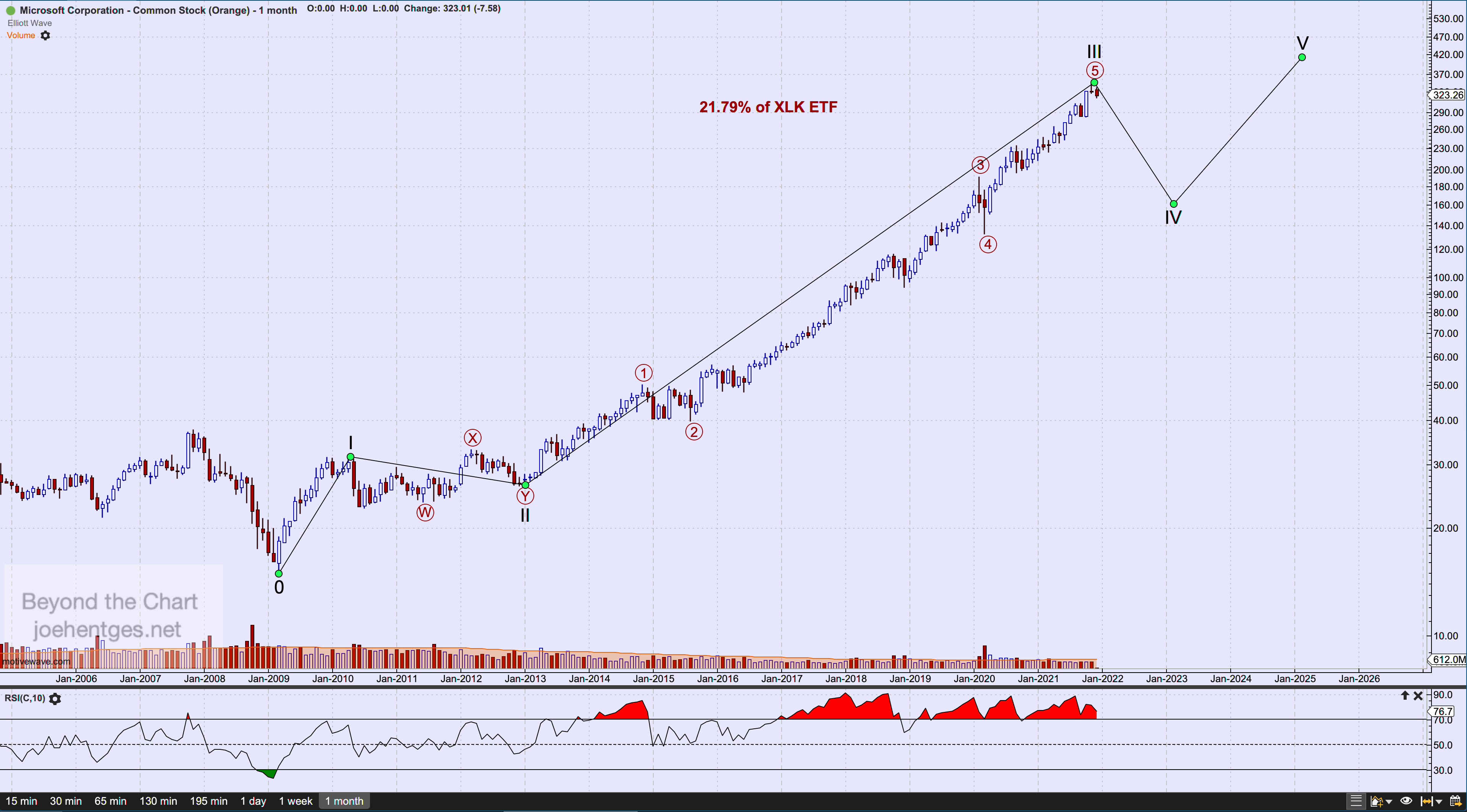
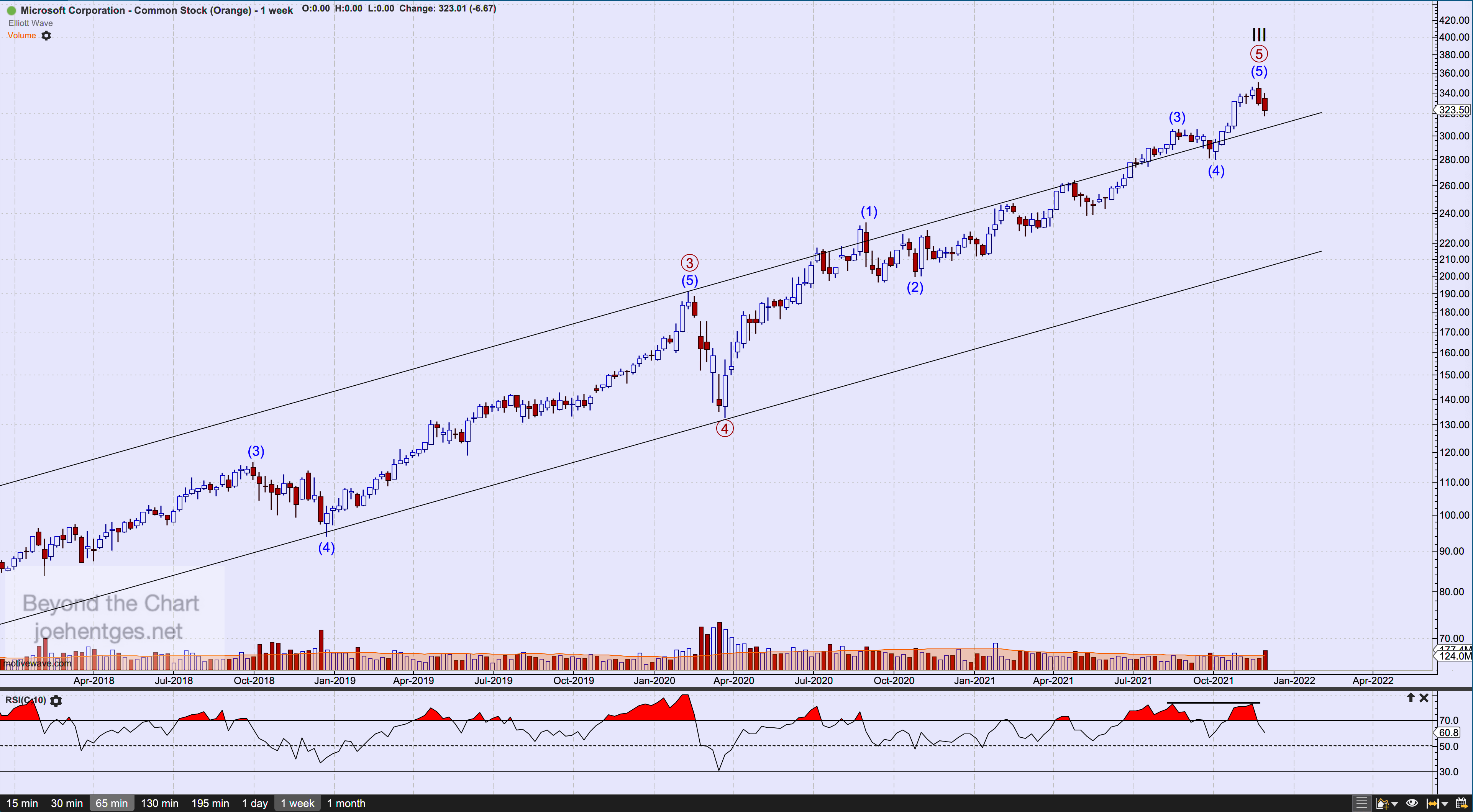
The chart below is the monthly chart of MSFT. I show a wave count from the March 2009 low. Similar to AAPL, MSFT just completed a huge Cycle Wave III ending with the $349.67 high the week of November 21, 2021.  It has now begun its Cycle Wave IV which should take many months to complete and may take a variety of shapes.  I expect this to pull back into the territory of the previous Primary Wave 4 (circled). 

Data thru December 3, 2021

The weekly chart below shows five waves complete from the March 2020 low. Again for this count to hold, the November 22 high needs to hold.  Next target will be a break of the Intermediate Wave (4) low at $280.25.

Data thru December 3, 2021

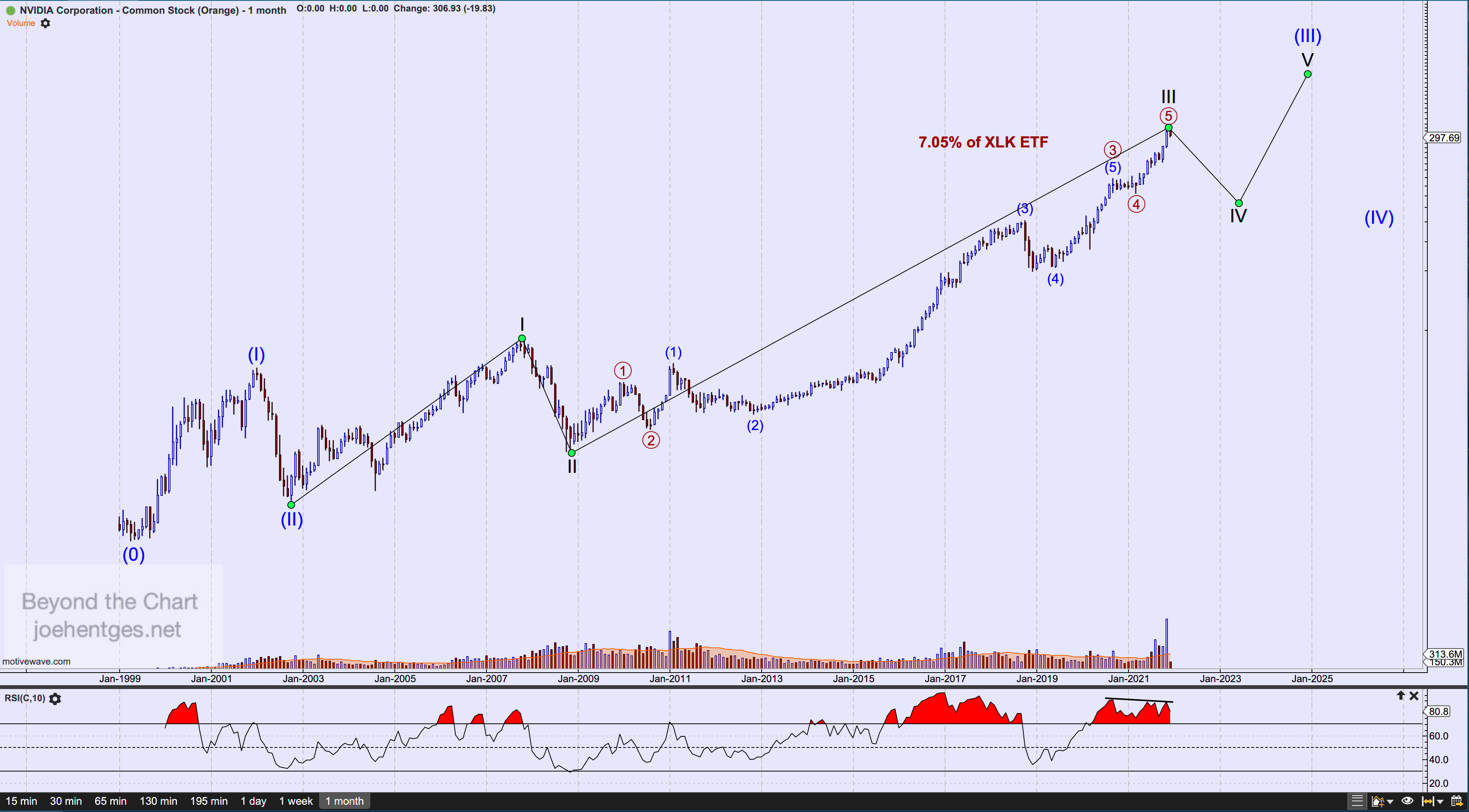
Our last stock is NVDA. The monthly chart below shows all the data since it went public in January 1999.  The Elliott Wave count shows a SuperCycle Wave III underway from the October 2002 low. I believe that Cycle Wave III of SuperCycle Wave (III) is complete with the high of $346.47 on November 22.  It will now undergo a Wave IV correction that should chop sideways. 

Data thru December 3, 2021

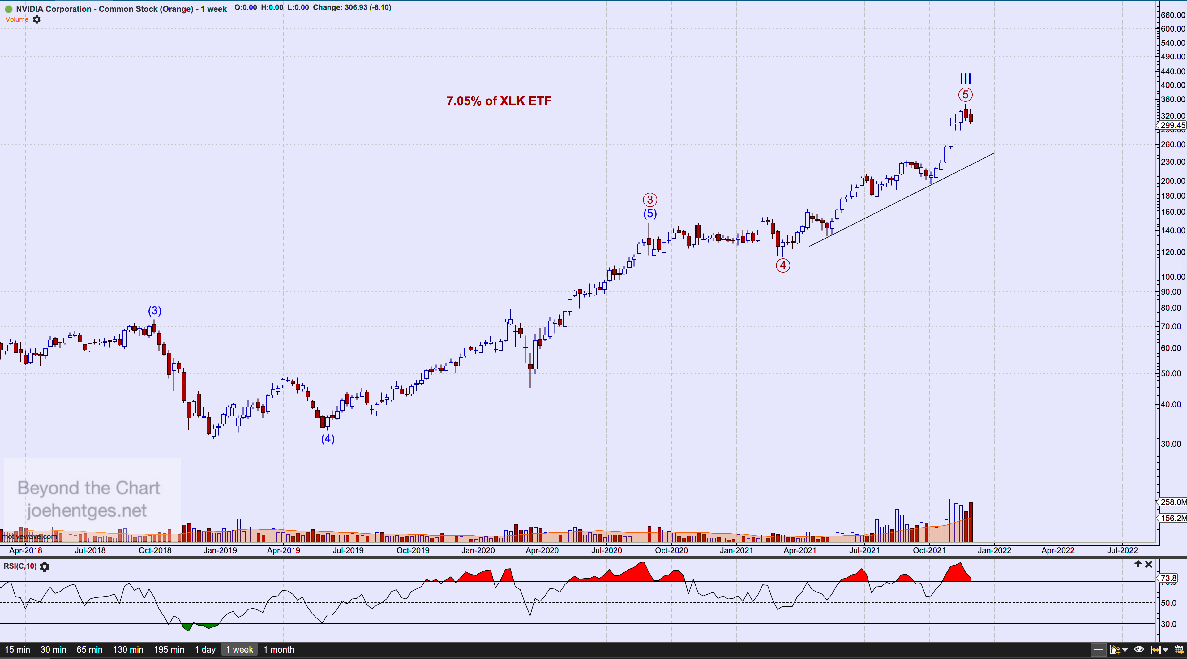
The weekly chart of NVDA shows a relatively short Primary Wave 5 (circled). If the high of $346.47 is indeed in, then price should break down thru the trend line shown on the chart.  

Data thru December 3, 2021

Crude Oil Squeeze?

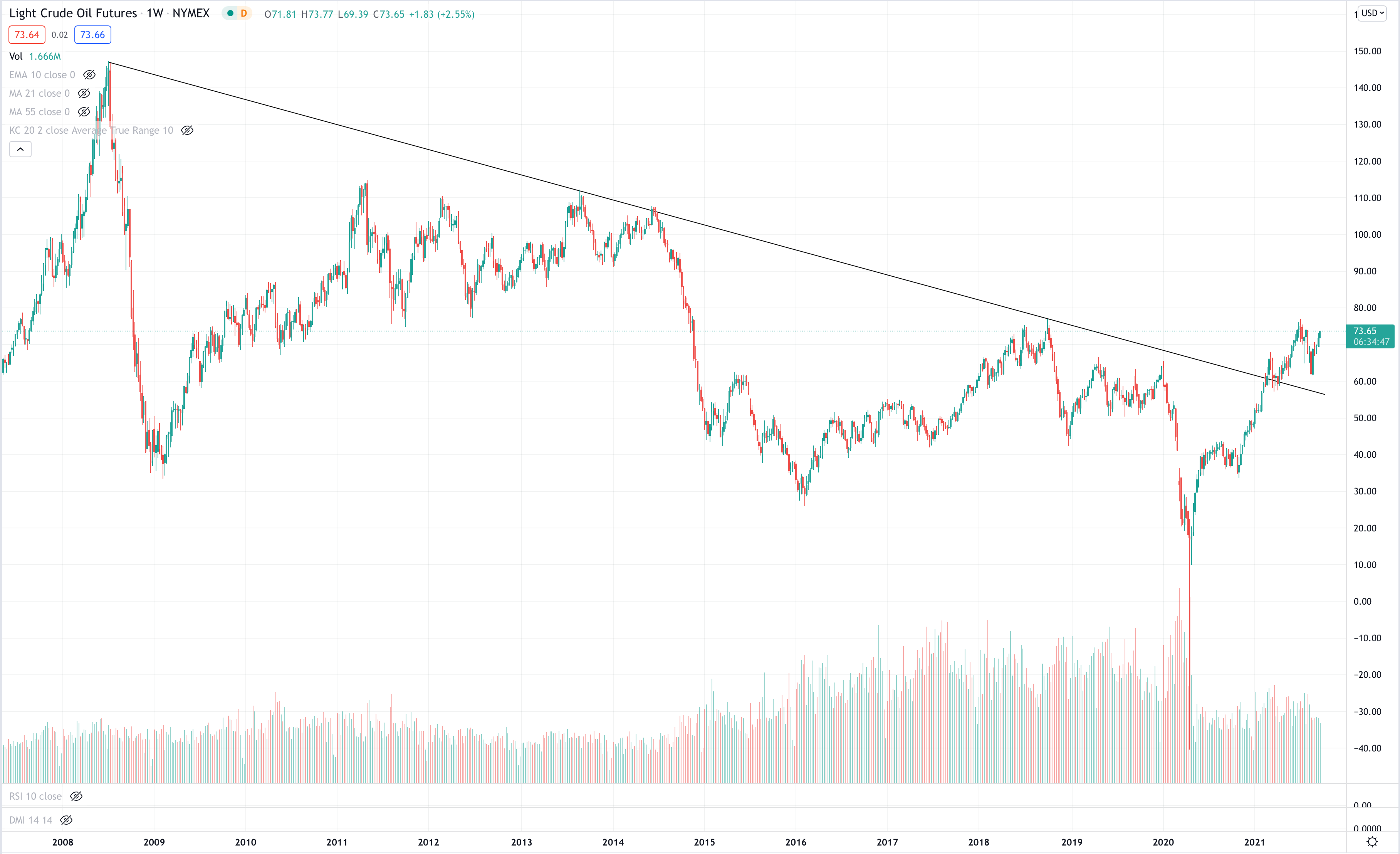
It’s no secret that commodities have been in one heck of a rally over the last year or so.  And that includes crude oil. Light Crude Oil futures fell to a never seen before -$40.32 in April 2020. They have since rallied to a high of $76.98 in July of this year. In the process, Light Crude Oil futures broke a 13 year downtrend from the peak in July 2008.

There appears to be overhead resistance at $77 which when broken would enable Light Crude Oil futures to surge possibly into the 90’s.  What could possibly cause a crude oil squeeze and drive the price significantly higher? Any number of things but I don’t think it matters. What matters is the price action.  

Data thru Sept. 24 10am CT

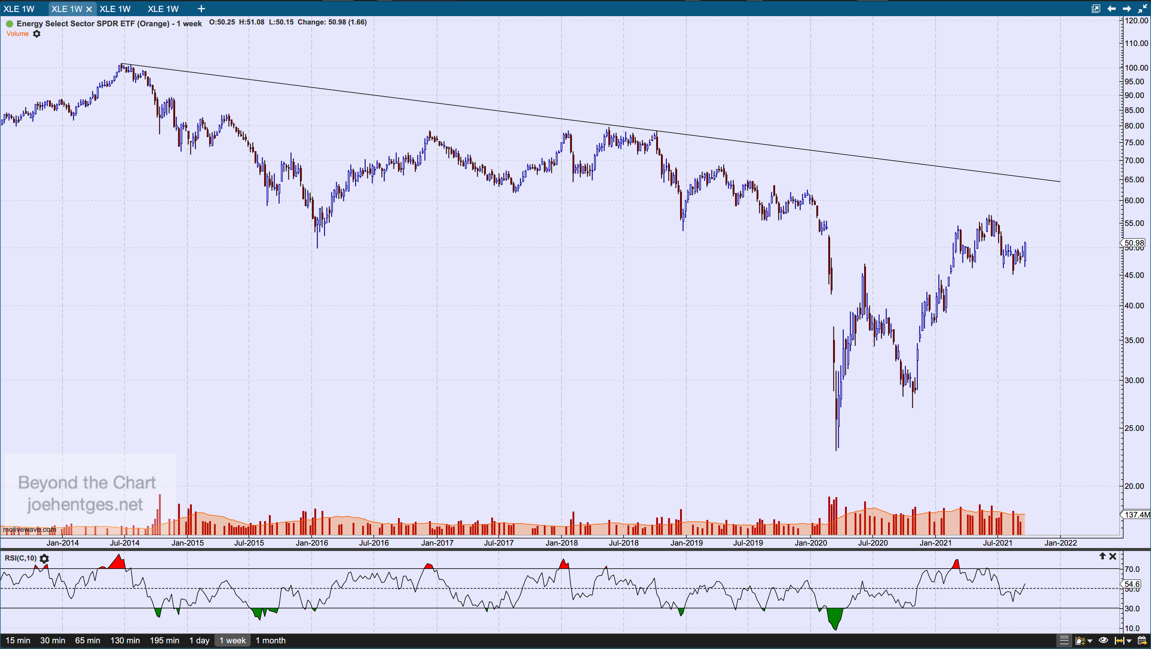
So what about energy stocks? Let’s take a look at the Energy Select Sector SPDR ETF (XLE). From a high of $101.52 in June 2014 they dropped to an intra-week low of $22.88 in March 2020. XLE rallied back to an intra-week high of $56.65 in early June of this year. They have since pulled back some but appear primed to challenge that 2021 high. 

Data thru Sept. 24 10am CT

In the daily chart below, XLE appears to be breaking out of a small Head & Shoulders Bottom pattern.  This projects to the $56 area.  Beyond that, there appears to be plenty of overhead challenges. We’ll see how strong this decides to get. And how much of a move occurs in Light Crude Oil futures. 

Data thru Sept. 24 10am CT

89 Year Echo

Must Consult the Past

"Whoever wishes to foresee the future must consult the past; for human events ever resemble those of preceding times...this arises from the fact that they are produced by men who have been, and ever will be, animated by the same passions."   - Machiavelli

A View From Inside a Stock Market Bubble

So what does a stock market bubble look like? I say just look around. In this post I review many of the signs that have shown up in the first quarter of 2021.  There are extremes all around. Some like we have never seen before. It’s a little bit like walking thru a woods and not being able to see the forest because of all the trees. We are right in the middle of it. 

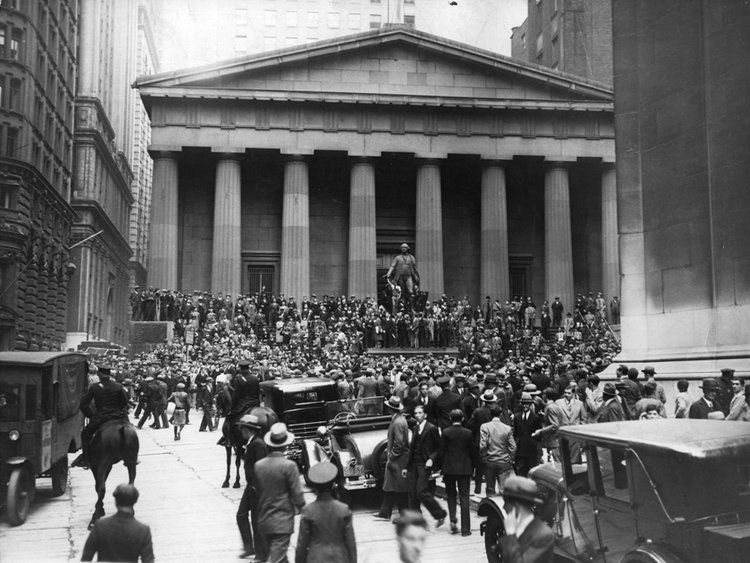
When I think of sentiment and extremes, I think of that story of a shoe shine boy in 1929. As the story goes, when Joseph Kennedy heard his shoe shine boy giving him stock tips in the summer of 1929, he decided the market had gone too far and sold everything, thus avoiding the 1929 Crash.

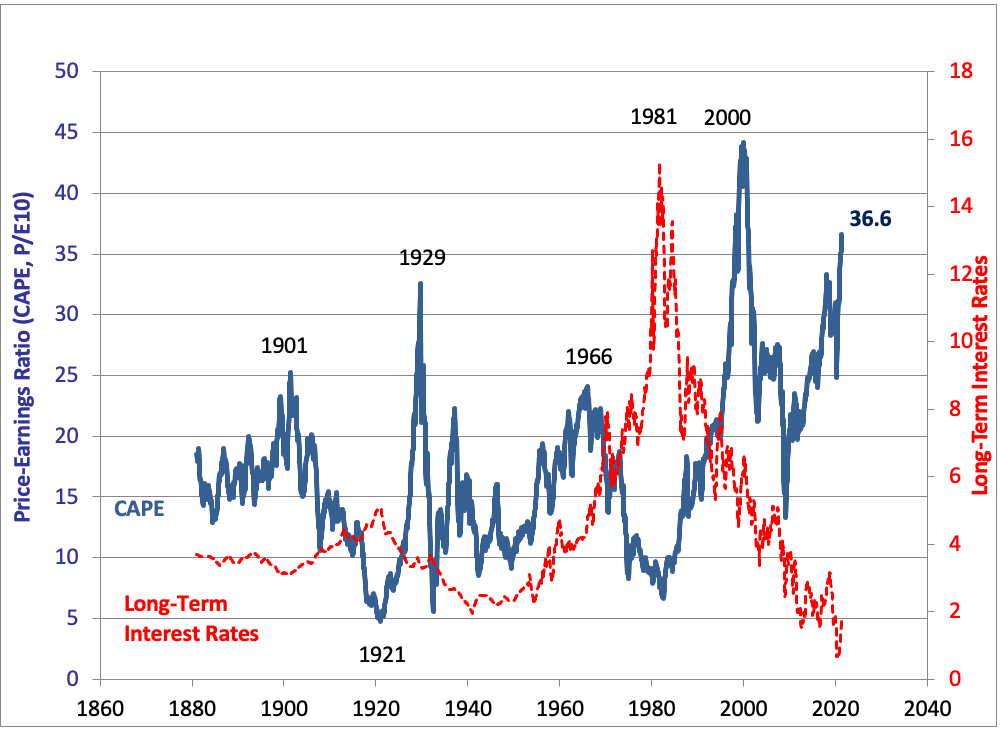
So in order to get a measure of where we are now, let’s look at the latest CAPE data from Professor Robert Shiller.  CAPE is his Cyclically Adjusted Price Earnings Ratio created in the late 1990’s and discussed in his famous book Irrational Exuberance published in March 2000, the exact month the Nasdaq and S&P 500 (SPX) peaked and 2 months after the Dow Jones Industrial Average (INDU) peaked.

In the chart below you see the latest reading is 36.6 which is higher than 1929 and 2007.  There is only one period of irrational exuberance that is greater than where we are now and that is the period from November 1998 to the peaks in the stock market indexes in January to March 2000.  This chart also shows the history for long-term interest rates which tells an interesting story by itself. 

Although not labelled on the chart, the two lowest CAPE readings since the 1929 peak came at the Supercycle Wave IV bottom in June 1932 at 5.57 and the end of Cycle Wave IV of Supercycle Wave V in July, August 1982 at 6.64. 

Source: Professor Robert Shiller

I like to look at a person’s actions versus what they say. Let’s take a look at two groups of investors/traders. The first group is what I call the Wall Street crowd.  This group consists both of public corporations and Wall Street firms.  These entities show their extreme behavior by taking companies public via the SPAC (Special Purpose Acquisition Companies) route or traditional IPOs (Initial Public Offerings).  

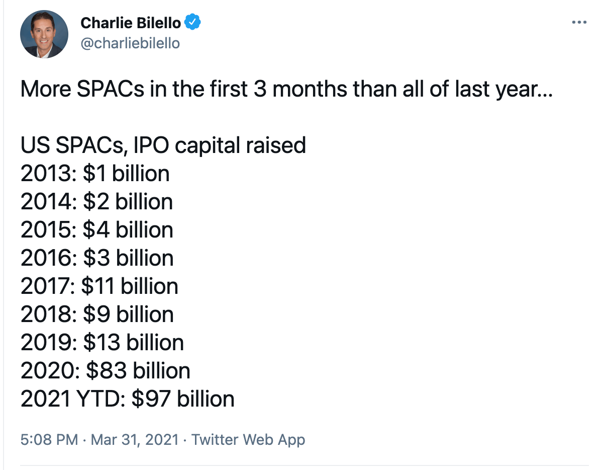
In the image below Charlie Bilello shows some recent SPAC data. In 2020 the dollar volume of SPACs was over 6 times that of the previous year. And in the first 3 months of 2021 alone,  the SPAC volume exceeds all of 2020.

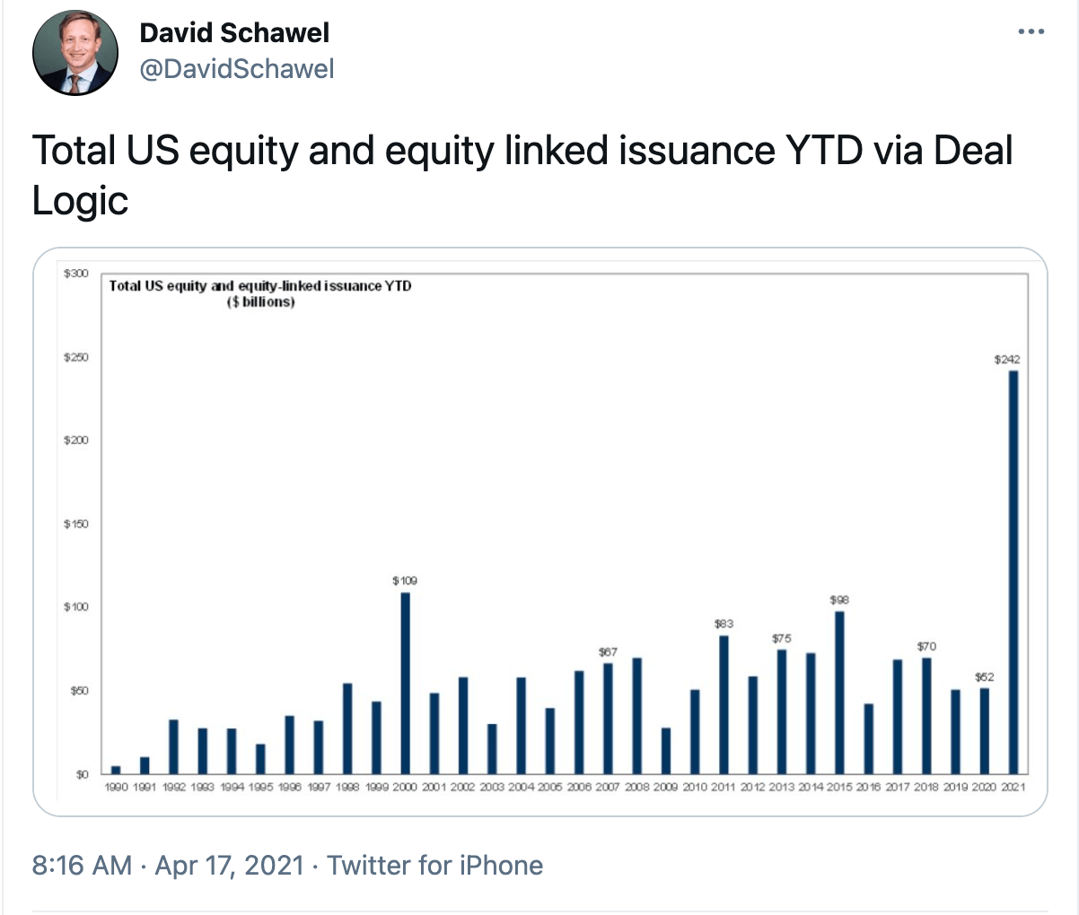
Now for more of a total picture of equity issued in the stock market, here is data from Deal Logic provided by David Schawel. The numbers are astounding.  The total dollar volume is over twice as much as in 2000 at the peak of the dotcom craze and yet this number is for just the first 3 months of 2021. 

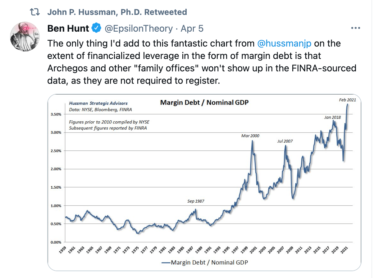
The individual investor/trader is the other group I want to focus on. Let’s take a look at some of the extreme action taking place.  So when people get overly confident and greedy, with a dash FOMO thrown in, they take on margin debt to try and maximize the return.  Now margin debt has undoubtedly grown with the size of our economy. To adjust for that, John Hussman shows how even when you divide margin debt by GDP, it is at levels never seen before.  And Ben Hunt also comments on this chart about debt that is not accounted for in this data.

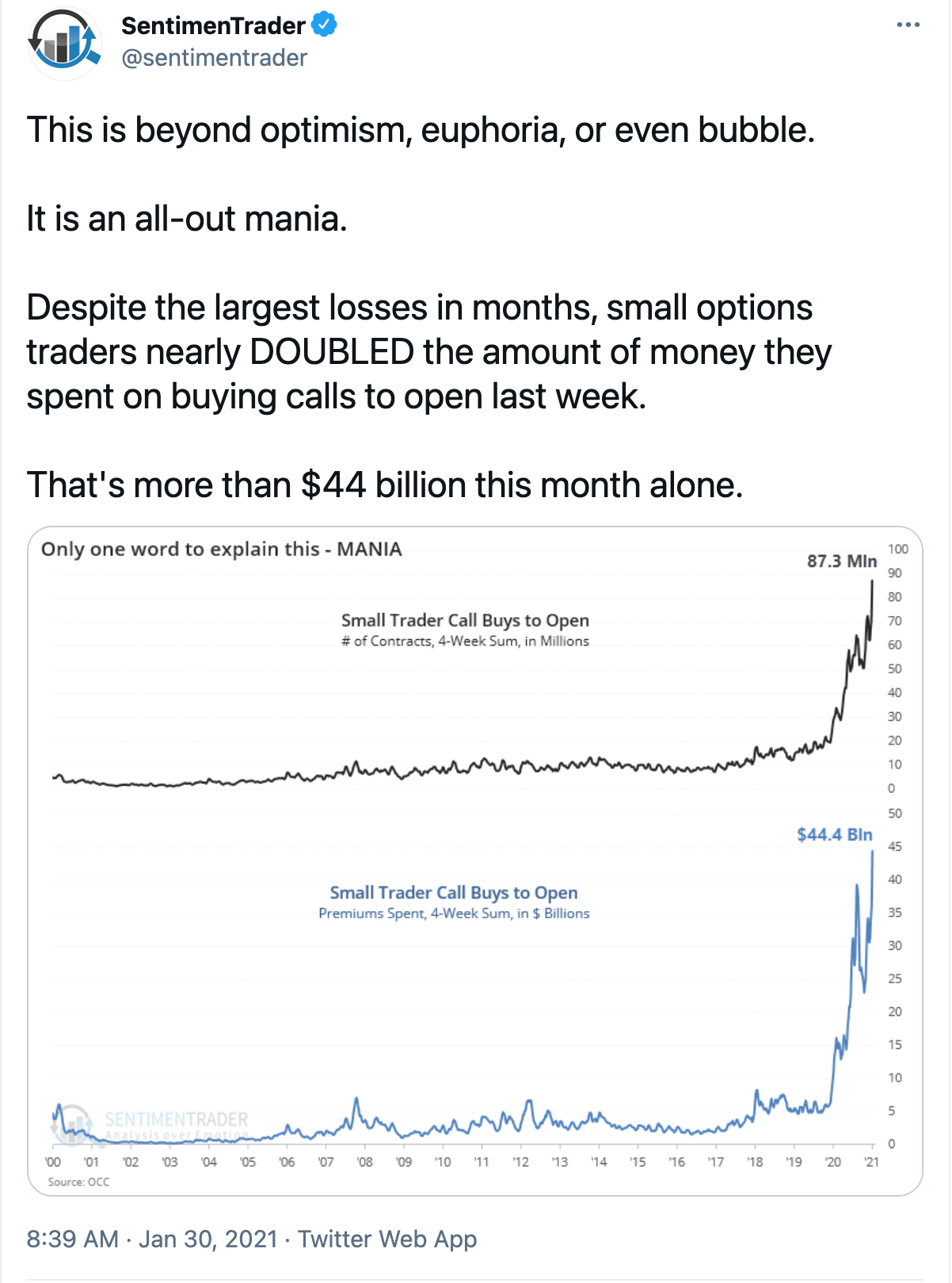
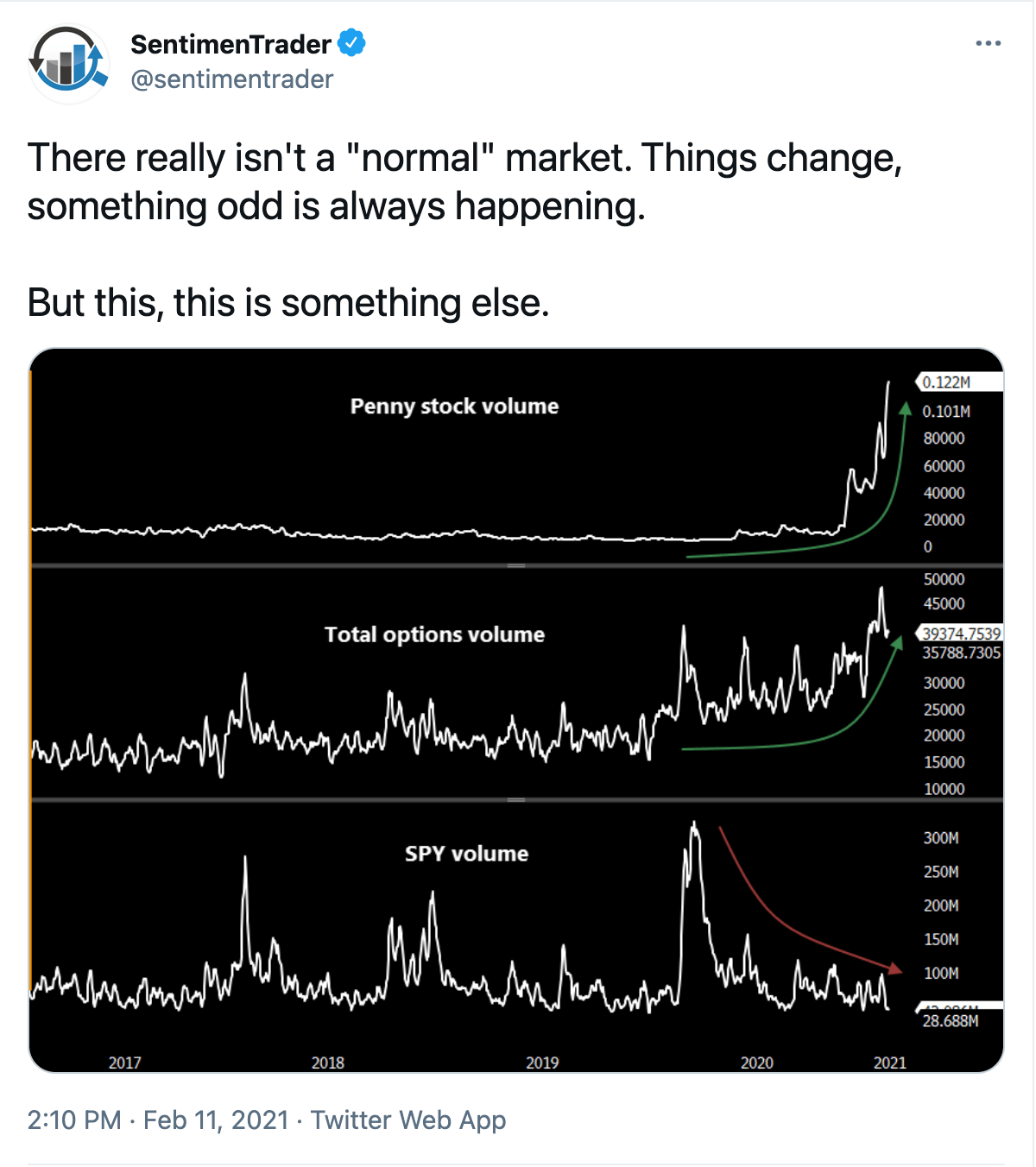
In these next two graphs we’ll focus on options trading and show the extremes exhibited by call option buying which are bets on future bullish movement. Both of these charts are from Sentiment Trader.  

So what we are seeing are extremes in many cases, beyond anything shown at the peak in 2000.  You now know what it is like to be on the inside of a stock market bubble.  Sentiment figures do not help with timing, but they sure provide the setting and the warning flags.  We continue to monitor Elliott Wave structure and price action to stay alert for changes in trend.  

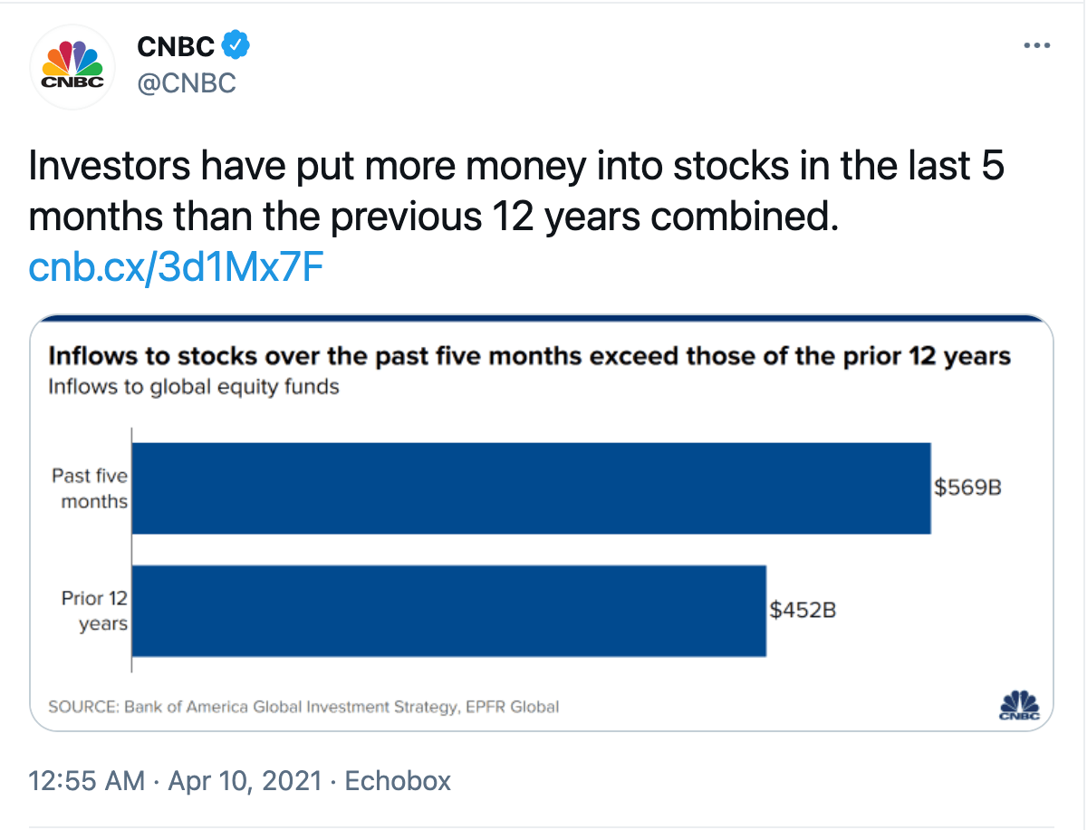
And finally I’ll end with this graph from CNBC.  I call this a Supercycle FOMO.

Powered by WishList Member - Membership Software