
This post is based on information provided daily to the Insider Membership.
I like looking at option sentiment because it tells you what people are actually doing versus what people say they are doing. When I talk about option sentiment I’m talking about the level of trading in puts and calls. For those of you unfamiliar with options, a call option is simply a contract that allows you to make money when a stock or index goes up. A put option allows you to make money when a stock or index goes down.
So when there is significantly more activity in calls versus puts that is a sign that bullishness is getting extreme. Another way to look at this is simply puts versus calls and that is why it is called the Put/Call ratio. Overall there is more bullishness in the market than bearishness so you have to take that into account when looking at option sentiment.
The data I look at comes straight from the Chicago Board of Options Exchange (CBOE). And specifically I look at option trading on equities only. So just stocks, not indexes. I’ve kept this data since November 1, 2006. I have the raw data and then calculate the 10 day moving average. This is what I use for the primary signal for option sentiment. Sometimes an individual day will also give a clue as to what might be happening.
So I bucket my signals into excessive, extreme and ultra extreme categories for both bullish and bearish scenarios. Usually the data will provide signals that are several days to weeks long but sometimes it is only just one day. I think of the excessive readings as warning flags that something is up and things could be about to change. If that reading is just a one day signal, it’s kind of a “shot across the bow” warning.
I am not going to share the actual levels that define these various categories, as that would not be fair to the Insider Members. But let’s take a look at where these signals have occurred over the last 2 years. The two charts below are for the S&P 500 Index (SPX) and show the daily view. In the first chart, there was a tremendous period of excessive bullishness that lasted 9 weeks and included a 6 day period of extreme bullishness right at the top, January 23-30, 2018.
The period in May and June 2018 also had a couple instances of excessive and one period of extreme bullishness but no market collapse. After the huge break in early February it was almost as if option traders were expecting the next shoe to drop but nothing major happened. It started to sell off in mid-June but then turned around.
Then came the warning flags in late August and late September that preceded the huge selling avalanche of the 4th quarter. That 2nd period of excessive bullishness lasted from September 20 to October 3.
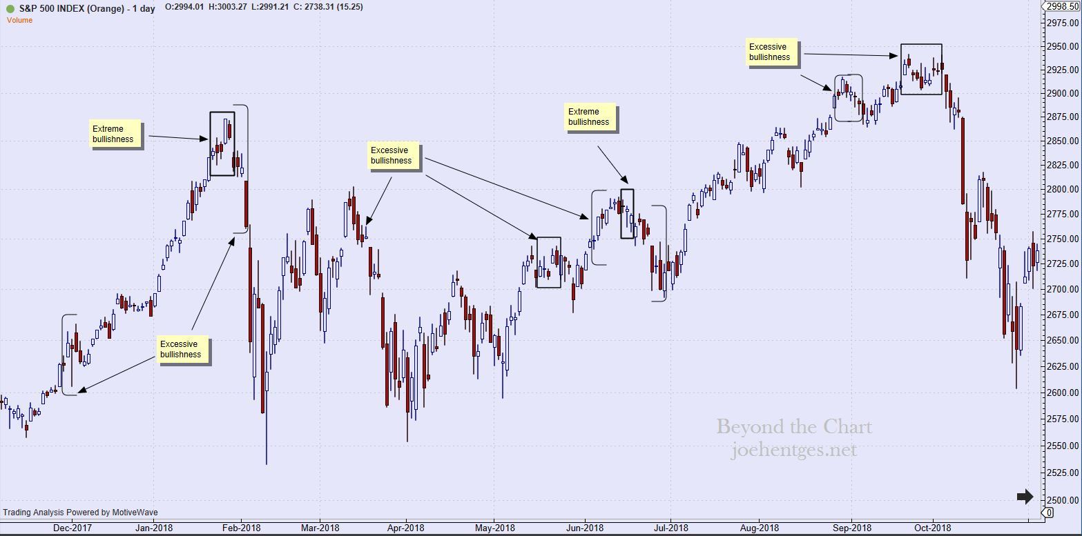
Daily view from Nov 2017 thru Oct 2018
The next chart begins with December 2018 thru today. The selling in December got extreme and this too was reflected in the Put/Call ratios. Then we got the huge rally in January that just kept on pushing higher. First warning flag appeared in late February but only resulted in a minor pullback. The second warning seemed to coincide with the minor pullback in late March but that too did not go anywhere.
Then came the third period of excessive bullishness in late April and that preceded a pretty strong selloff into mid-June. But since late April the only signals sent were one day “shots across the bow” at the beginning of July and in mid-September. I view these one day signals as if they were a flare sent up. Not enough to raise the warning flag, like on a beach for danger, but enough to say, ‘heads up’.
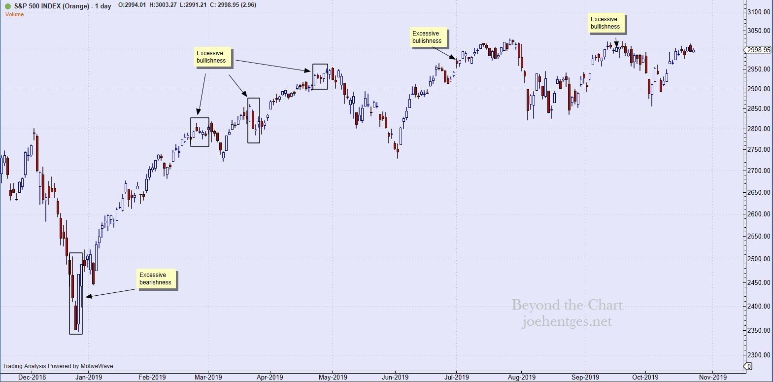
Daily view from Dec 2018 thru Oct 23, 2019