Category Archives for "Market Analysis"

Super Cycle Tops

Note: This is an update to a post created about 4 years ago.

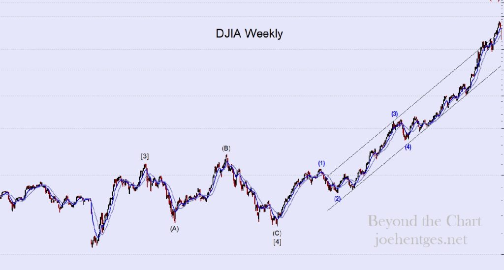
Look at the two charts below.  
 

stock market setup

Primary Wave 3 peak in 1916 – Primary Wave, Cycle Wave and Super Cycle Wave peak in 1929


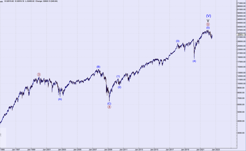
Primary Wave 3 peak in 2000 – Primary, Cycle and Super Cycle peak in January 2022

Look at both charts. Look at the price action between (B) and (C) in Primary Wave [4] on both charts. 

The first chart shows the price move in the Depression of 1920-21 in which the DJIA lost 46.6% of its value.

The second chart shows the Great Recession of 2007-09 in which the DJIA lost 53.8% of its value.  

The Depression of 1920-21 lasted 18 months and experienced tremendous deflation. In fact it was the largest drop in wholesale prices since the Revolutionary War… -36.8%.  Unemployment hit 19%. The Depression of 1920-21 set the stage for the huge stock market rally of the 1920s that ended in the Crash of 1929.  That was followed by the Great Depression that lasted 10 years.

The Great Recession of 2007-09 lasted 18 months and experienced no deflation (as reported). Although house prices dropped dramatically due to that sector being at the heart of the crisis.  Unemployment hit 10% (as reported) and the world financial markets came perilously close to collapse.

Following the end of the Expanded Flat Primary Wave 4 correction in both time periods, a huge run in the stock markets of the United States and around the world occurred.

The DJIA peaked in 1929 at 6 times the value of the lowest close during the Depression of 1920-21.  It was a tremendous 8 year run.

This time the DJIA peaked in January 2022 at about 5.6 times the lowest closing pricing of the Great Recession. Nearly identical to the multiple of 1929. Its run took nearly 13 years.

The shape of the pattern of prices from 1916 to 1921 and those of 2000 to 2009 are nearly identical. The length of time for the bull runs had a Fibonacci relationship, 8 to 13. 

This peak in the stock market is the end of an 89.5 year Super Cycle Wave from July 1932. (89…another Fibonacci number). And now the Super Cycle correction…


Gold and the Miners

I use the Gold ETF (GLD) as a proxy for the price action in gold. We are experiencing a strong bout of inflation right now, running at 40 year highs. It seems to be out of control.  It is affecting everything…except gold.

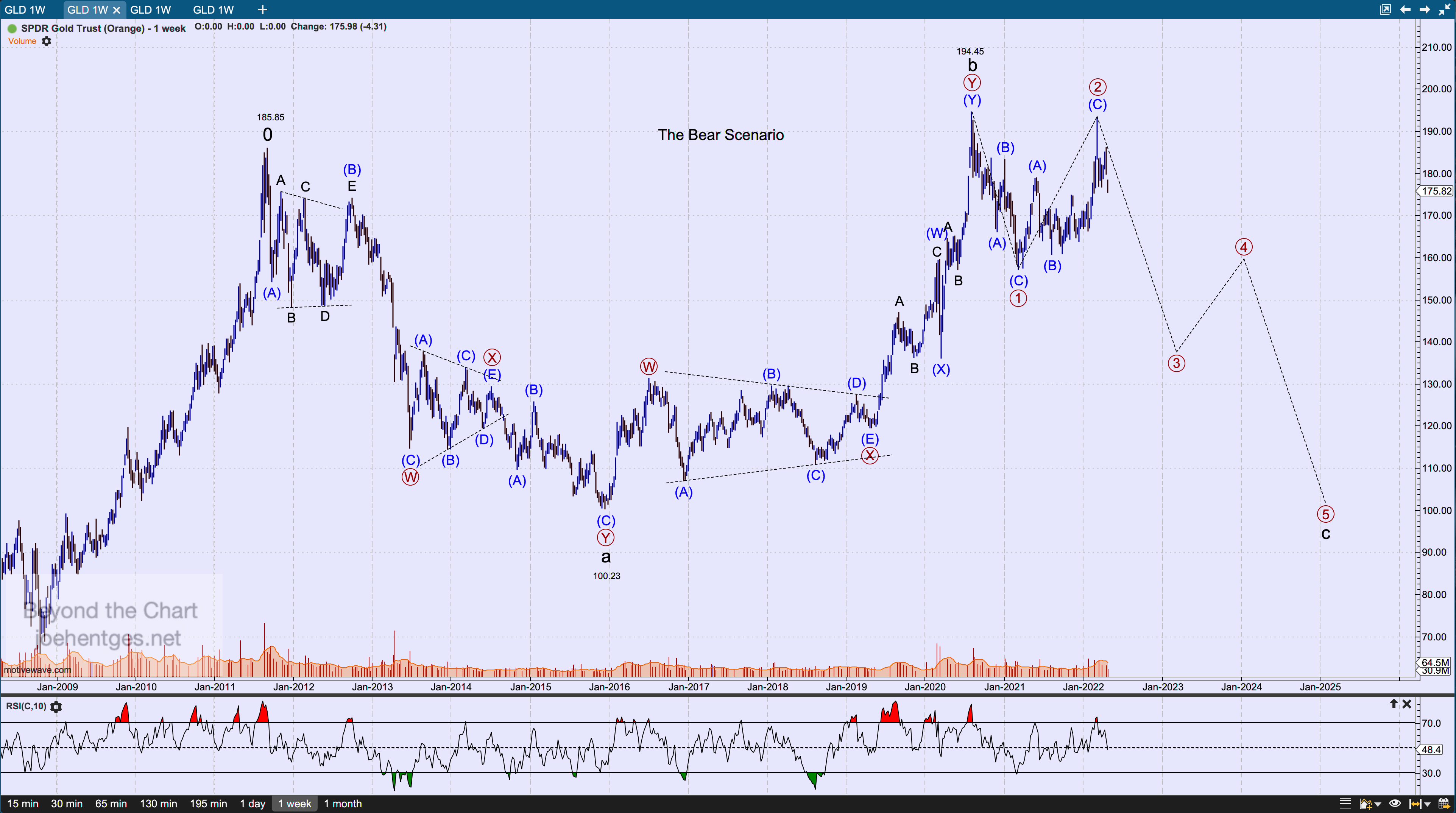
Gold really hasn’t reacted to the inflation news. GLD reached a high of 194.45 on August 6, 2020 which was tested again on March 8, 2022 hitting an intra-day high of 193.30 but that was it. GLD closed at 175.98 on April 27, 2022.  

So after trying to support the bullish view for a long time, I am now moving to the bear camp. The chart below is a long-term weekly chart of GLD. This chart shows the September 2011 high of 185.5 followed by a double three W-X-Y corrective pattern that concluded "Cycle Wave a" at 100.23 in December 2015.  

This was followed by another W-X-Y "Cycle Wave b" that punched to a slightly higher high as part of a large Elliott Wave “Flat" pattern. And we are now in Primary Wave 3 (circled) of "Cycle Wave c". Based on the price action of the last 2 years "Cycle Wave c" is carving out an ending diagonal pattern much lower. 

Where does this pattern fail? If GLD pushes above 194.45 then I would have to re-visit the bullish scenario.

Data thru April 27

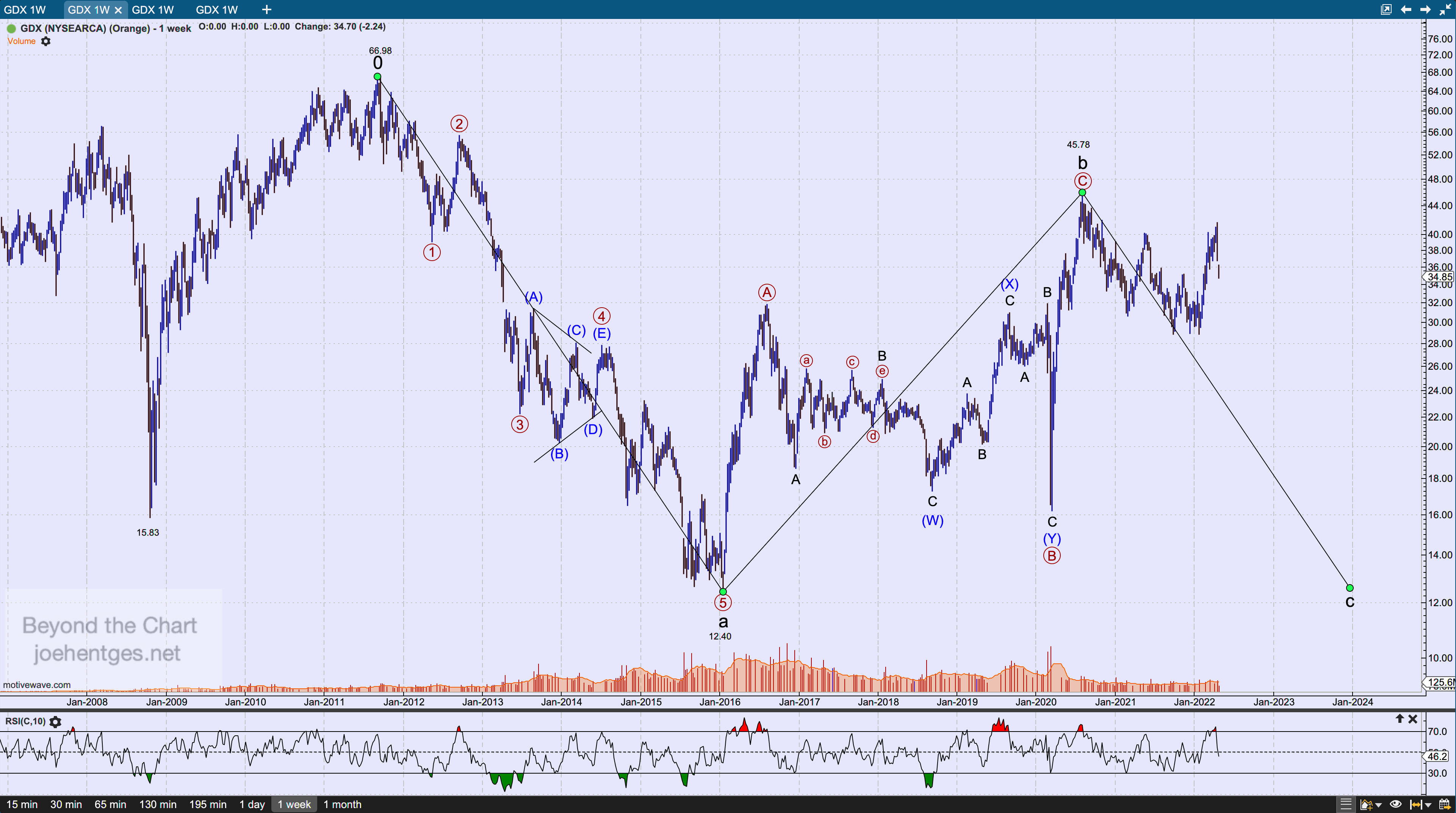
The gold miners are not in sync with gold and in fact have been a lot weaker, not confirming higher moves.  The first chart below is the Gold Miners ETF (GDX) weekly chart.  GDX and GLD were in sync at the high in September 2011 but GDX sold off in a 5 wave "Cycle Wave a" move to a low below that of the 2008 collapse.  The 5 wave move is significant in that it indicates the first leg of a corrective move down.

GDX then moved to a high of 45.78 in "Cycle Wave b" that did not even come close to confirming GLD’s push to a new high in 2020. So now GDX is in "Cycle Wave c” subdividing lower.

Data thru April 27

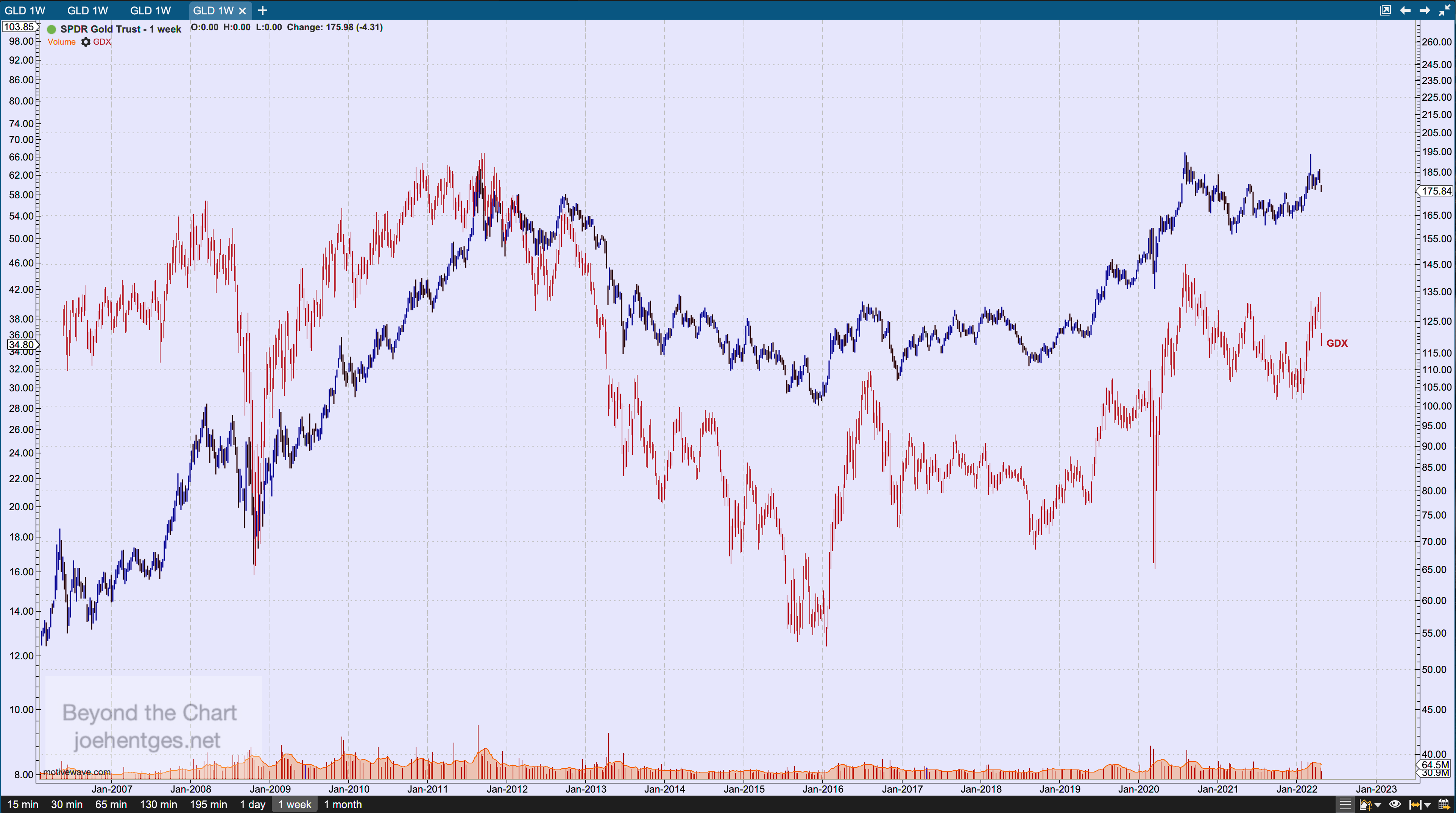
For comparison purposes the next chart shows GDX overlayed on top of GLD.  GLD in blue with its scale on the right.

Data thru April 27

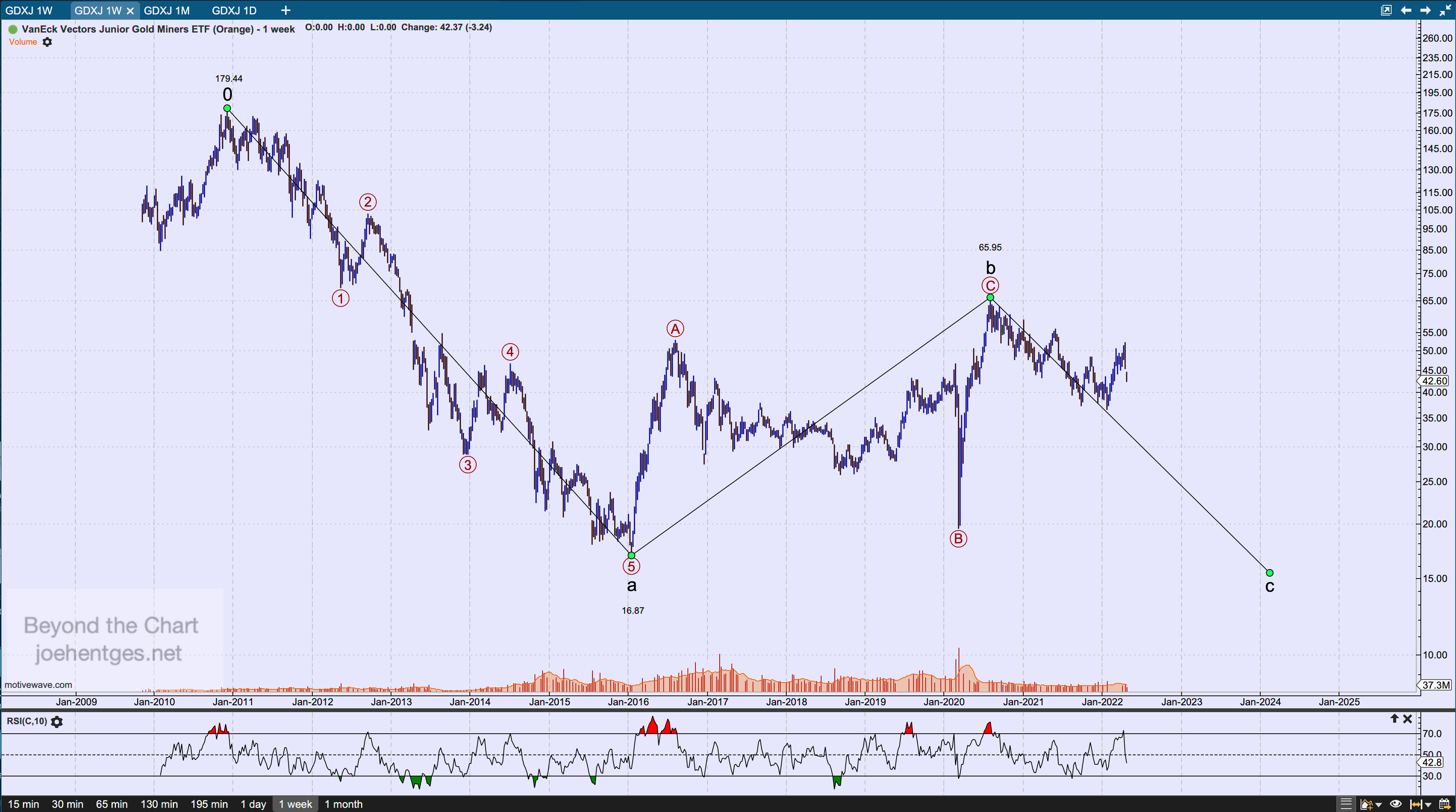
Not to be left out are junior gold miners. The Junior Gold Minors ETF (GDXJ) is shown in the next chart. It mirrors the GDX price action but is weaker. The 2020 high was only 37% of the December 2010 high. More recently the 2022 high did not even exceed the May 2021 high. GDXJ is now moving lower in "Cycle wave c". 

Data thru April 27

89 Year Echo

Must Consult the Past

"Whoever wishes to foresee the future must consult the past; for human events ever resemble those of preceding times...this arises from the fact that they are produced by men who have been, and ever will be, animated by the same passions."   - Machiavelli

A View From Inside a Stock Market Bubble

So what does a stock market bubble look like? I say just look around. In this post I review many of the signs that have shown up in the first quarter of 2021.  There are extremes all around. Some like we have never seen before. It’s a little bit like walking thru a woods and not being able to see the forest because of all the trees. We are right in the middle of it. 

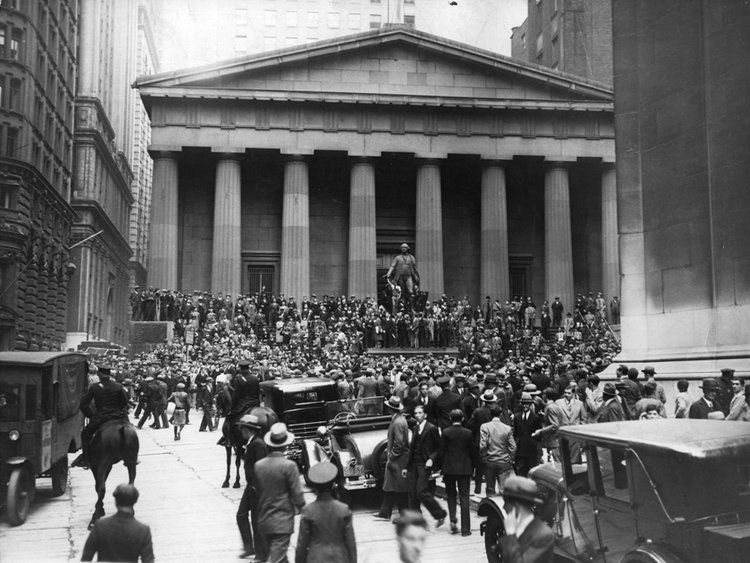
When I think of sentiment and extremes, I think of that story of a shoe shine boy in 1929. As the story goes, when Joseph Kennedy heard his shoe shine boy giving him stock tips in the summer of 1929, he decided the market had gone too far and sold everything, thus avoiding the 1929 Crash.

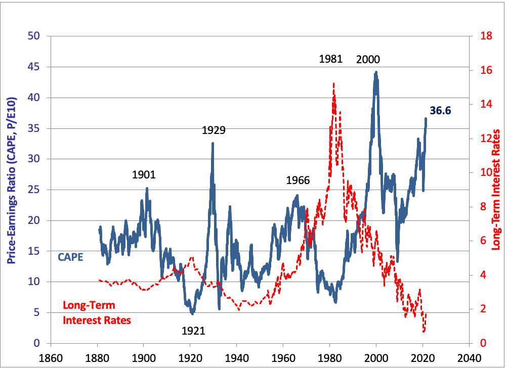
So in order to get a measure of where we are now, let’s look at the latest CAPE data from Professor Robert Shiller.  CAPE is his Cyclically Adjusted Price Earnings Ratio created in the late 1990’s and discussed in his famous book Irrational Exuberance published in March 2000, the exact month the Nasdaq and S&P 500 (SPX) peaked and 2 months after the Dow Jones Industrial Average (INDU) peaked.

In the chart below you see the latest reading is 36.6 which is higher than 1929 and 2007.  There is only one period of irrational exuberance that is greater than where we are now and that is the period from November 1998 to the peaks in the stock market indexes in January to March 2000.  This chart also shows the history for long-term interest rates which tells an interesting story by itself. 

Although not labelled on the chart, the two lowest CAPE readings since the 1929 peak came at the Supercycle Wave IV bottom in June 1932 at 5.57 and the end of Cycle Wave IV of Supercycle Wave V in July, August 1982 at 6.64. 

Source: Professor Robert Shiller

I like to look at a person’s actions versus what they say. Let’s take a look at two groups of investors/traders. The first group is what I call the Wall Street crowd.  This group consists both of public corporations and Wall Street firms.  These entities show their extreme behavior by taking companies public via the SPAC (Special Purpose Acquisition Companies) route or traditional IPOs (Initial Public Offerings).  

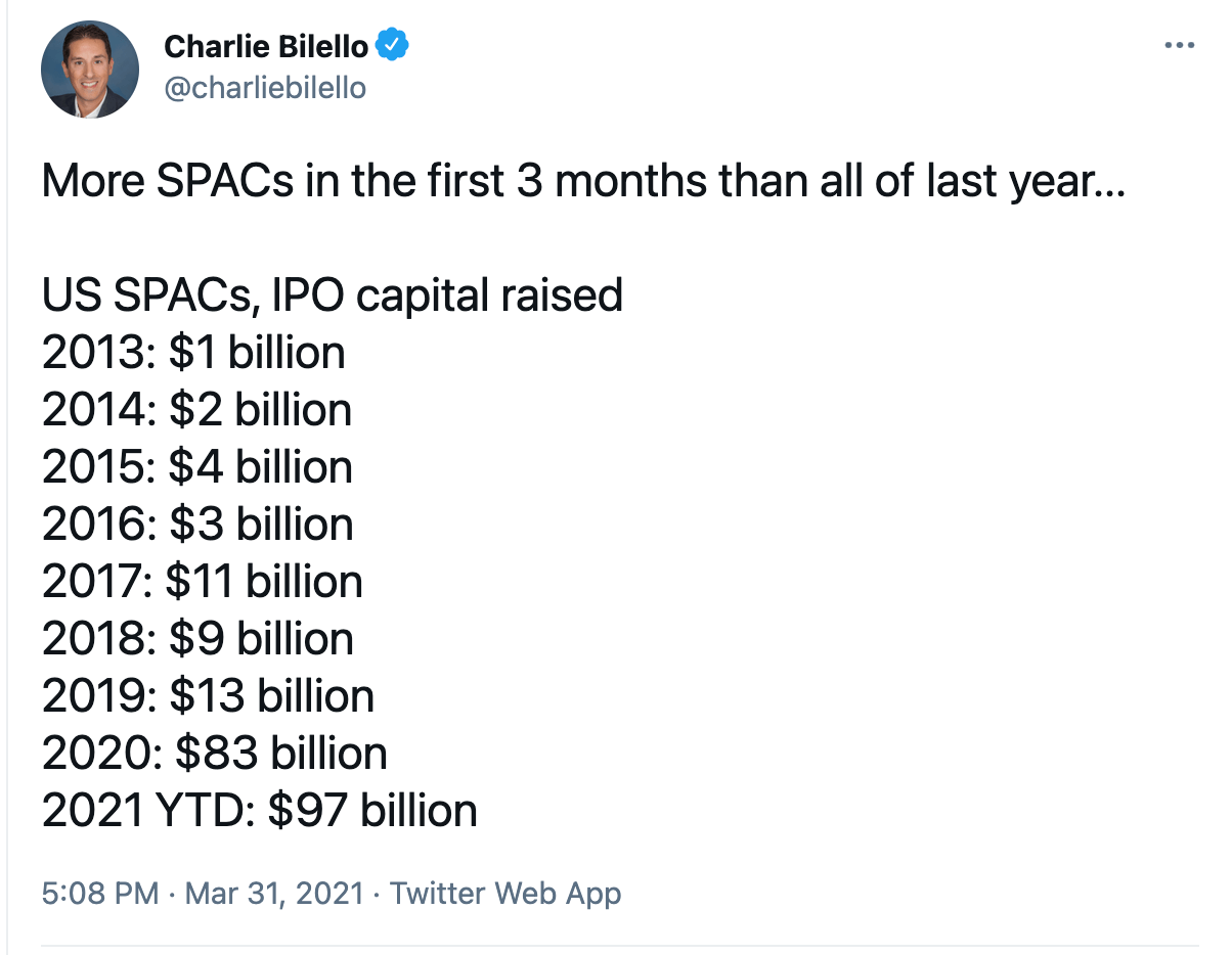
In the image below Charlie Bilello shows some recent SPAC data. In 2020 the dollar volume of SPACs was over 6 times that of the previous year. And in the first 3 months of 2021 alone,  the SPAC volume exceeds all of 2020.

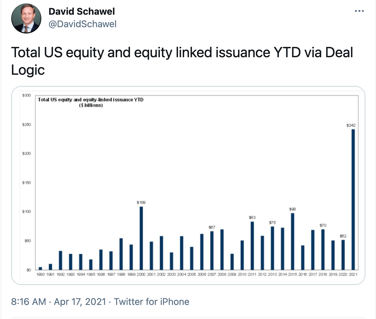
Now for more of a total picture of equity issued in the stock market, here is data from Deal Logic provided by David Schawel. The numbers are astounding.  The total dollar volume is over twice as much as in 2000 at the peak of the dotcom craze and yet this number is for just the first 3 months of 2021. 

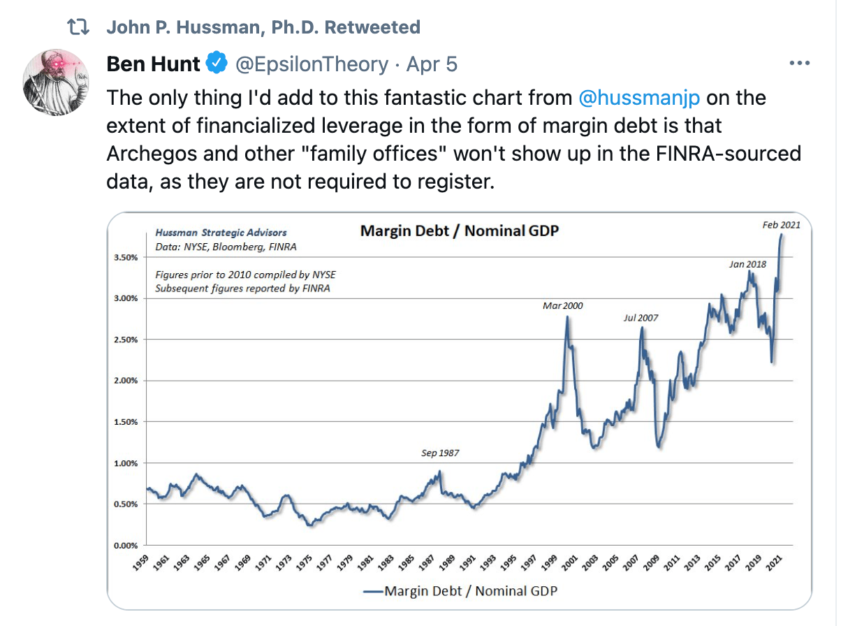
The individual investor/trader is the other group I want to focus on. Let’s take a look at some of the extreme action taking place.  So when people get overly confident and greedy, with a dash FOMO thrown in, they take on margin debt to try and maximize the return.  Now margin debt has undoubtedly grown with the size of our economy. To adjust for that, John Hussman shows how even when you divide margin debt by GDP, it is at levels never seen before.  And Ben Hunt also comments on this chart about debt that is not accounted for in this data.

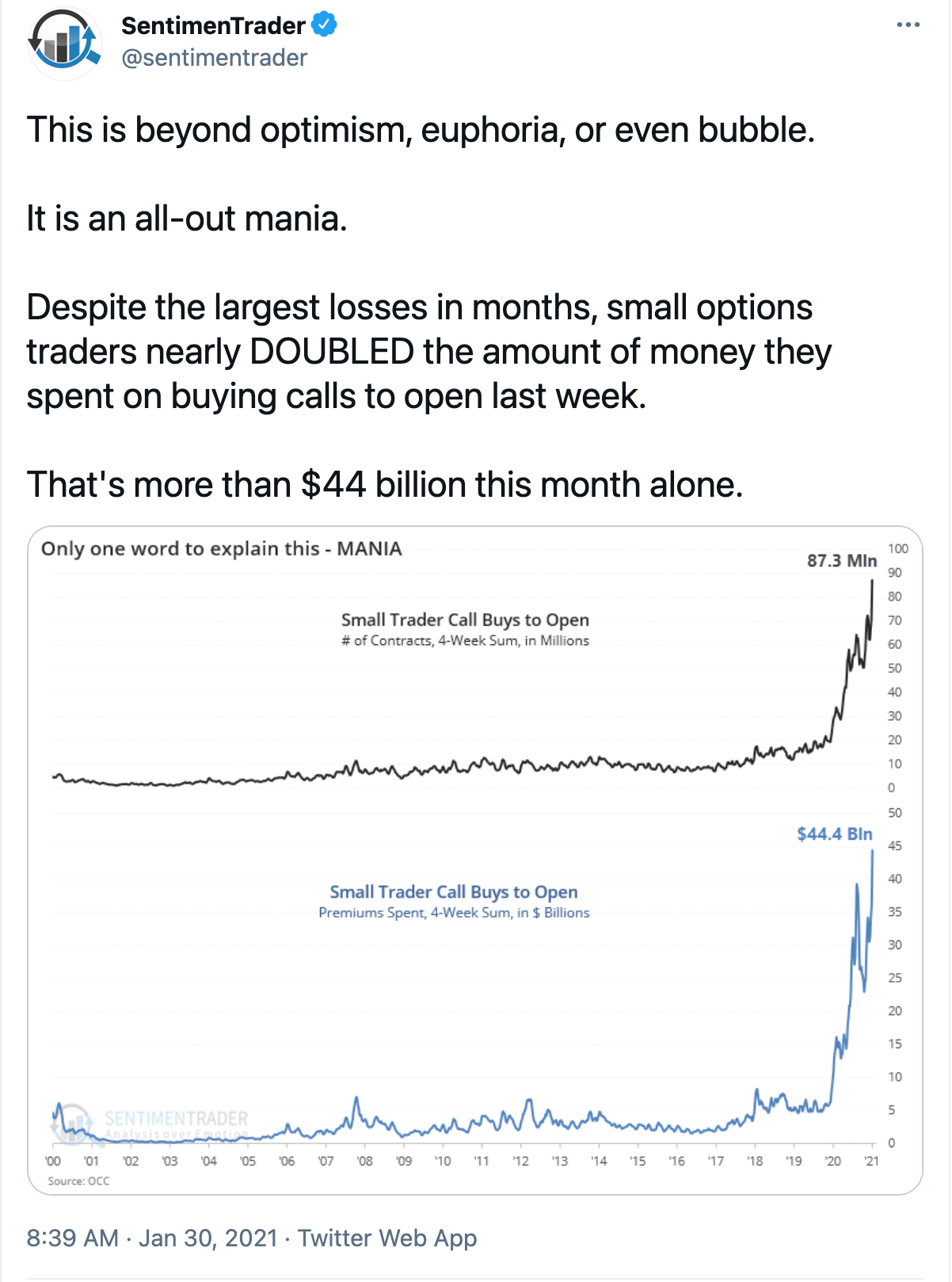
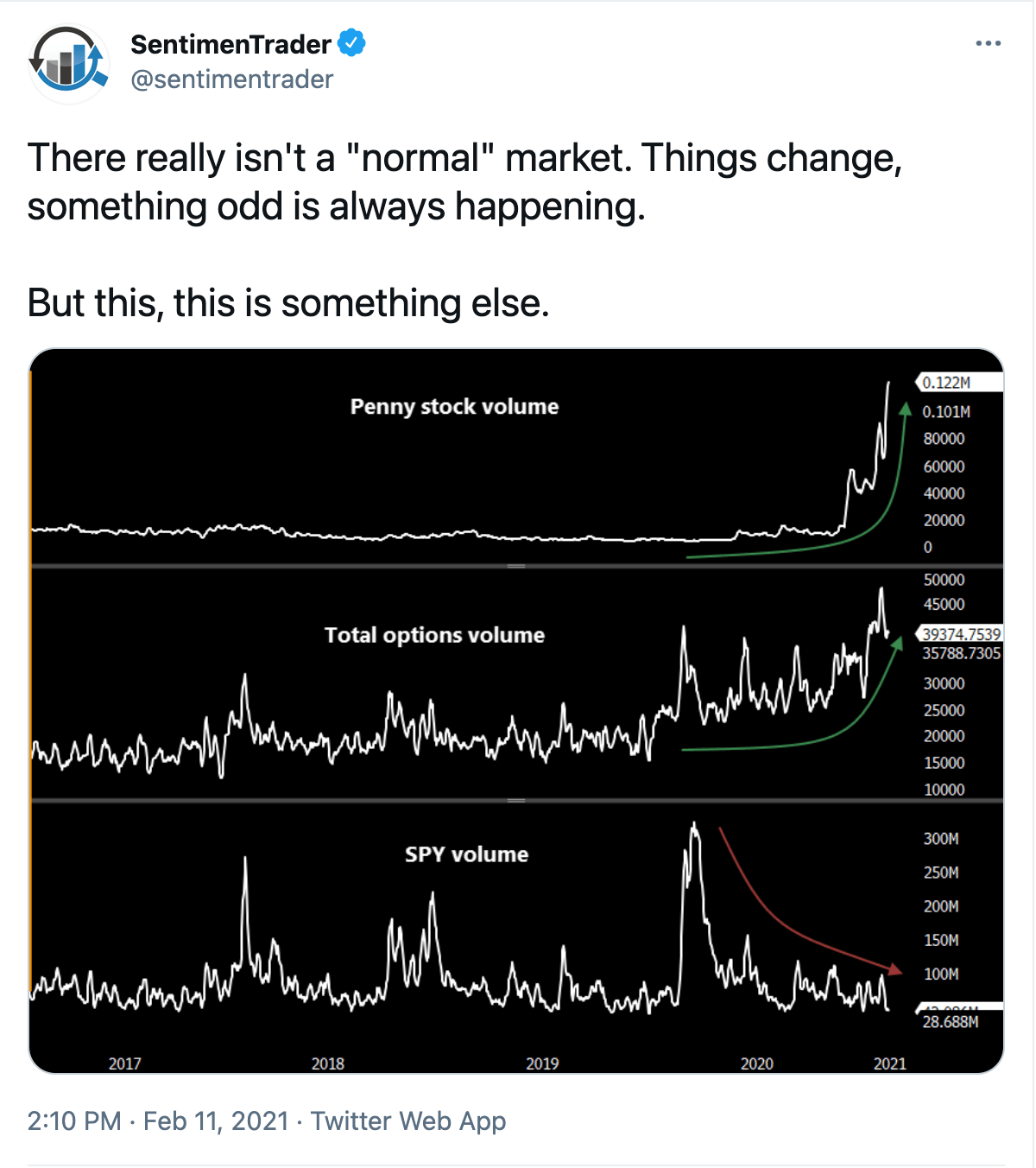
In these next two graphs we’ll focus on options trading and show the extremes exhibited by call option buying which are bets on future bullish movement. Both of these charts are from Sentiment Trader.  

So what we are seeing are extremes in many cases, beyond anything shown at the peak in 2000.  You now know what it is like to be on the inside of a stock market bubble.  Sentiment figures do not help with timing, but they sure provide the setting and the warning flags.  We continue to monitor Elliott Wave structure and price action to stay alert for changes in trend.  

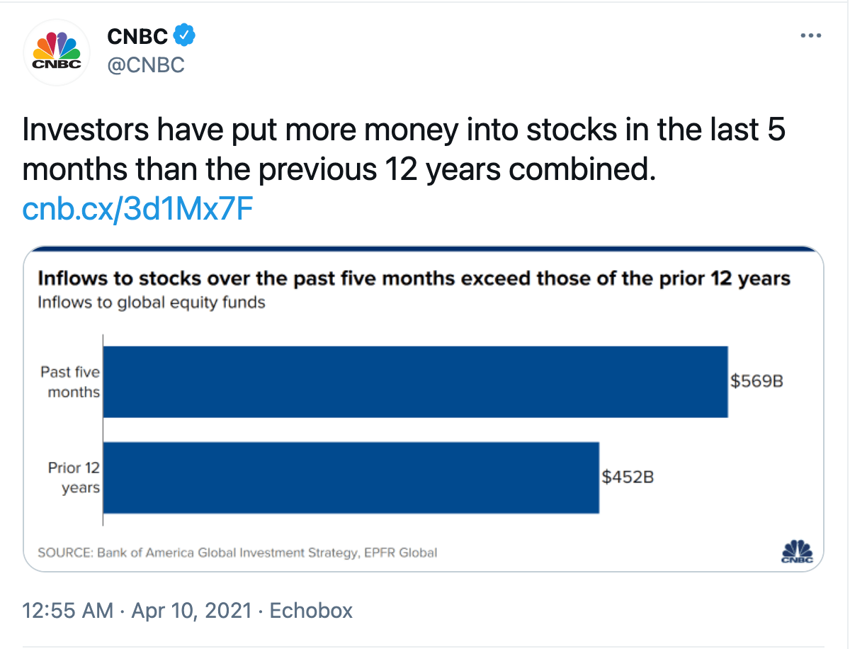
And finally I’ll end with this graph from CNBC.  I call this a Supercycle FOMO.

Powered by WishList Member - Membership Software