
The stock market keeps pushing higher to new all-time highs every week. It doesn’t matter if you look at the Dow Jones Industrial Average, the S&P 500 or the Nasdaq Composite Index, they are all sitting at all-time highs. But the stock market has given us this stock market setup once before.
Look at the two charts below. Which chart is 1916 – 1929 and which chart is 2000 – 2018?
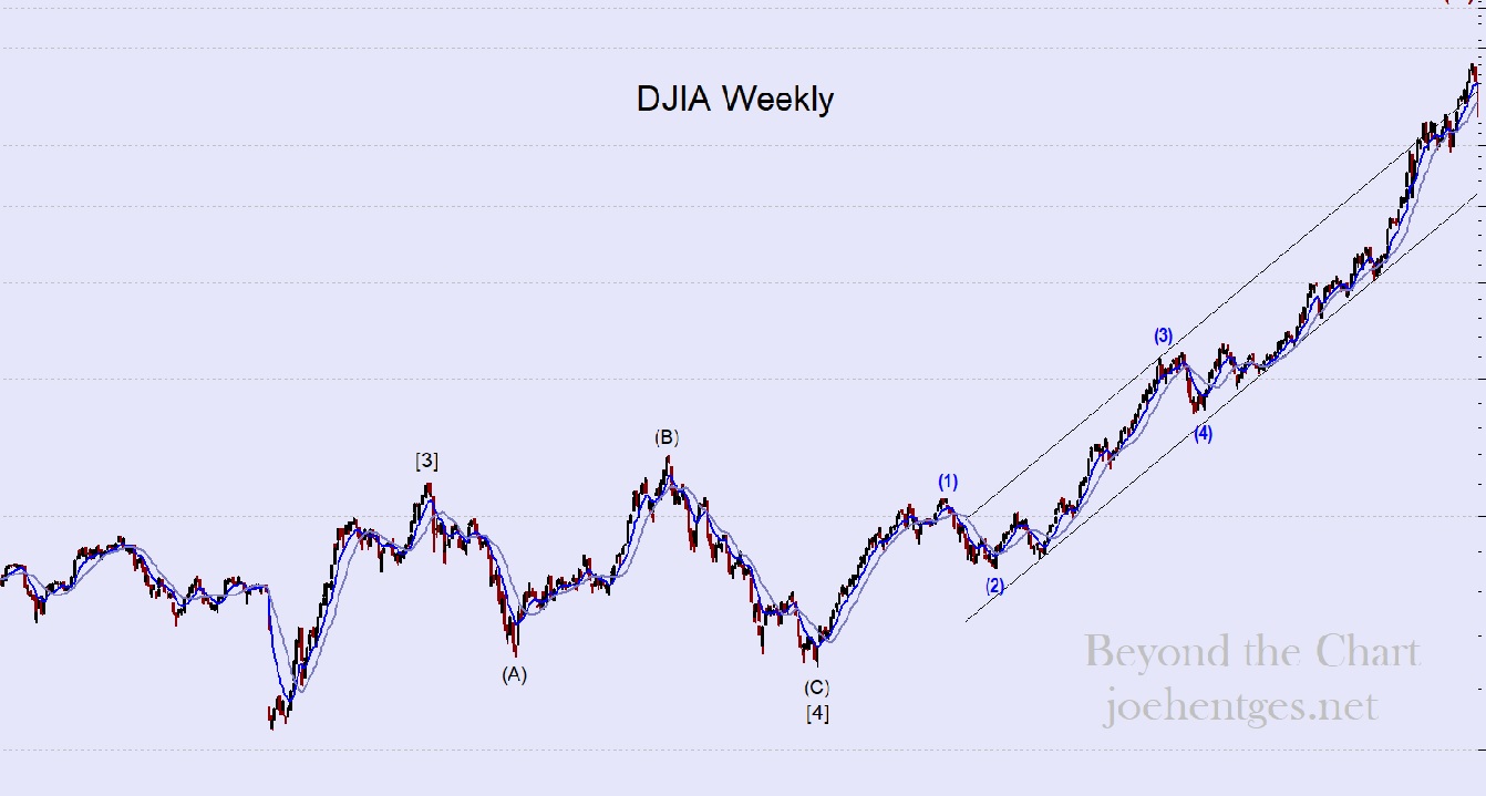
Chart A
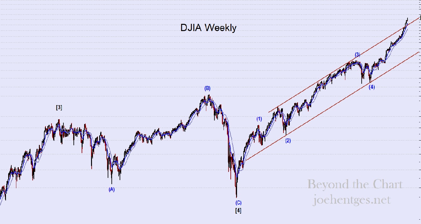
Chart B
Look at both charts. Look at the price action between (B) and (C) in Primary Wave [4] on both charts. One of those moves is the price move in the Great Recession of 2007-09 in which the DJIA lost 53.8% of its value. And the other chart is shows the price move in the Depression of 1920 – 21 in which the DJIA lost 46.6% of its value.
The Depression of 1920-21 lasted 18 months and experienced tremendous deflation. In fact it was the largest drop in wholesale prices since the Revolutionary War… -36.8%. Unemployment hit 19%. The Depression of 1920-21 set the stage for the huge stock market rally of the 1920s that ended in the Crash of 1929. That was followed by the Great Depression that lasted 10 years.
The Great Recession of 2007-09 lasted 18 months and experienced no deflation (as reported). Although house prices dropped dramatically due to that sector being at the heart of the crisis. Unemployment hit 10% (as reported) and the world financial markets came perilously close to collapse.
But that was followed by a huge run in the stock markets of the United States and around the world as money flooded the globe in order to try and keep things afloat.
The DJIA peaked in 1929 at 6 times the value of the lowest close during the Depression of 1920-21. It was a tremendous 8 year run.
Currently the DJIA is nearly 4 times the lowest closing pricing of the Great Recession. If it continues to push higher into March 9, the move will have lasted 9 years.
The shape of the pattern of prices from 1916 to 1929 and those of 2000 to 2018 are nearly identical and are what caught my eye. But when you then realize what occurred in our economy at the end of Primary Wave [4] in both charts, you have to sit up and take notice.
So will the market end in a similar way to 1929 and be followed by another Great Depression? Who knows for sure. I do know that the stock market setup is eerily similar.
Oh and those charts…Chart A is the 13 year period from 1916-1929. Chart B shows 2000-present day.